
How a Brand’s Personality Becomes Its Visual Identity

Most identity projects stall on the same sentence: “I just don’t like green.” Someone in the room has a favorite color, a typeface they noticed on a competitor’s truck, or a logo sketched on a napkin years ago, and the conversation drifts toward what the owner likes instead of what the brand needs to say.
Taste is real, and it has a place. It makes a poor foundation for a visual identity, though, because your customers were never asked about your preferences. They respond to character. When brand personality is defined first, it gives the creative process a direction, and every decision about color, type, and imagery can be measured against it. This article explains how that happens, and why your visual identity should express who the brand is rather than who happens to be approving it.
What is brand personality, and how do you define it?
Before anyone opens a design file, you need an honest description of the character the brand should project. We often start with a simple question: if your company walked into a room, how would people describe it on the way out? The answers might be warm and unhurried, or precise and a little formal. Those become your brand attributes, the short list of qualities every piece of communication should carry. Keep it short. Once you pass four or five traits, they start contradicting one another, and the design team has nothing firm to hold.
Personality can’t be invented in isolation. It has to make sense to the people you serve. A pediatric dental practice and a litigation firm might both value trust, yet parents expect trust to feel gentle, while corporate clients expect it to feel formidable. Positioning matters as well. If every competitor presents as serious and corporate, a measured dose of warmth can set you apart. Values draw the outer boundary, since a company that prizes transparency shouldn’t look secretive or ornate. This groundwork sits at the center of a thoughtful brand strategy, and skipping it is why so many identities look polished and still feel vague.
How does personality turn into color, type, and layout?
Think about how you size someone up when you first meet them. Their clothes, the way they walk, even how they hold a door all hint at who they are. You don’t judge them by a single detail. You take in the whole picture, and people read a brand the same way.
Typography usually speaks first. Set a law firm’s name in a sharp, high-contrast serif, and the firm feels established before anyone reads a word. Set the same name in a soft, rounded sans serif, and it starts to look like a startup. Color changes a brand’s temperature, so navy tends to settle people while coral makes them lean in. Photography works more quietly, through its light and what it chooses to show. Layout decides how fast the reader moves. Leave plenty of white space and a page seems unhurried. Crowd it, and everything feels urgent.
None of these choices work alone. A brand that wants to feel calm can’t pair a quiet palette with crowded, frantic layouts, because the audience will sense the contradiction even if they can’t name it. Every element has to support the same overall feeling, much as a well-dressed person’s shoes agree with the rest of the outfit. When they do, the brand personality comes through as one coherent character instead of a collection of good ideas.
How do you choose the right visual direction?
Words like “bold” or “approachable” mean different things to different people. One stakeholder pictures bright orange and chunky type, and another imagines a confident black-and-white palette. If you move straight from a list of attributes to a finished logo, those private interpretations collide late in the process, when changes are expensive.
Stylescapes solve much of this. A stylescape is a curated visual board that brings typography, color, texture, photography, and sample layouts together into a single picture of how a direction might feel. We typically build two or three, each interpreting the same personality differently. One might lean toward quiet refinement, while another leans toward energy and warmth.


Seeing them side by side changes the conversation. Stakeholders stop debating individual swatches and start asking which direction sounds most like the company they know. It becomes easier to spot a concept that looks attractive but misrepresents the brand, and easier to borrow strengths from two concepts to shape a third. This is the stage where brand identity design gains its discipline, because the final identity is chosen against agreed criteria rather than by whoever argues longest.
How do you keep a visual identity consistent?
An identity proves itself after launch. The logo, palette, and type system have to hold up on a homepage, a trade show banner, a proposal template, a social post, and a business card, often produced by different people on different deadlines.
Consistency depends on documentation. A clear style guide records how each element is used, where the logo can and can’t sit, which color pairings meet accessibility standards, and how photography should be selected or art-directed. Templates carry that thinking into daily work, so a salesperson building a slide deck at 10 p.m. isn’t guessing.
Rigidity carries its own risk. A brand locked into one layout grows stale, and teams begin quietly breaking the rules to keep things fresh. A better approach defines what must stay fixed (usually the logo, core colors, and primary typefaces) and leaves room in secondary elements such as illustration style, supporting colors, or campaign imagery. Recognition comes from the fixed core. Flexibility keeps the brand feeling alive through years of new campaigns and channels.
Where personality and design meet
A visual identity is where personality stops being an idea in a strategy document and becomes something people can see. Done well, it makes a brand recognizable in a crowded feed and memorable after a single encounter, because each color, letterform, and image is saying the same thing about who you are.
That only happens when the brand personality is defined before design begins, tested through real visual directions, and protected by a system that can grow. Taste still has a role. It simply works for the brand instead of steering it.
Customers decide who you are before you say a thing. Make sure your colors, type, and imagery are telling them the right story. We’ve been helping brands find that alignment since 1999.
Let’s find out what your identity is saying.
Frequently Asked Questions
Q1. How do you define a brand’s personality?
Start with the people who know the business best, then check their answers against how customers actually describe you. Look for the handful of traits that show up in both places and that support where you want to compete. If a trait sounds flattering but no customer would ever use it, leave it out.
Q2. What is the difference between brand personality and a mission statement?
A mission statement explains why the company exists and what it’s working toward. Personality describes how the company behaves and feels while it does that work. Two firms can share nearly identical missions and still need very different identities, because one is reserved and exacting while the other is energetic and informal.
Q3. How long does a visual identity project take?
It depends on how much strategy is already in place, the scope of the identity system, and how many stakeholders need to approve the work. A focused project for a smaller organization may move faster than an identity for a multi-location company or institution. Much of the schedule goes to strategy and exploration, and that time is well spent because it reduces costly revisions later.
Q4. How do you keep a visual identity consistent as the brand evolves?
Decide early which elements are fixed and which are allowed to flex, then write that distinction into your style guide. The logo, core palette, and primary typefaces usually stay put, while campaign imagery and supporting graphics can change with the season. A partner experienced in branding and visual identity systems can build that structure so growth doesn’t turn into drift.
Q5. Can a brand personality change over time?
It can, and sometimes it should. A company that moves upmarket, merges with another firm, or reaches a new audience may find its old character no longer fits. The healthiest changes are gradual refinements rather than sudden reinventions, so existing customers still recognize who they’re dealing with.
Your Website Has Two Audiences Now: People and AI

More and more people meet your business through an AI assistant before they ever see your homepage. They ask a question, read a short summary, and arrive (if they arrive at all) with an opinion already formed. Somewhere in that exchange, a machine read your website, decided what it meant, and described you in its own words.
AI search visibility optimization is the work of making sure that description is right. The good news is that it doesn’t require your website to sound like a user manual. What AI tools need is mostly what good design has always delivered: clear language, solid structure, and proof that you know your stuff.
What does AI need from your website?
It needs you to say plainly what you do and who you do it for. AI assistants recommend what they can explain, and they can only explain what you’ve made clear.
Many business websites open with a mood instead of a fact. A line like “crafting experiences that matter” tells a visitor almost nothing, and it tells an AI tool even less. Compare that with “We design books and build brands for authors and independent publishers.” A person can repeat that accurately, and so can a machine.
Consistency matters just as much. If your homepage calls you a consultancy, your About page calls you a studio, and your service pages describe three different specialties, people sense the wobble. AI reads it as uncertainty. Choose your terms and use them the same way on every page.
Why does site structure matter to AI?
Structure tells AI what each piece of content is about. When an AI tool pulls an answer from your site, it relies on headings and page hierarchy to understand the context.
A heading like “Our Approach” could sit above anything. “How We Plan a Website Redesign” tells readers and crawlers exactly what follows. Each section should answer the question its heading raises, clearly enough that it still makes sense if someone lifts it out on its own. That’s the heart of answer engine optimization (AEO): pages built so their answers can be found and quoted.
The same goes for your whole site. Group related services together, link related pages to each other, and avoid pages that sit alone with nothing pointing to them. A well-structured web design and development approach helps create a website that’s easy for both visitors and AI tools to navigate.
Anyone who has designed a book already knows this. A clear table of contents, strong chapter heads, and a good index let a reader find one answer without reading everything. AI reads your website much the way a researcher uses an index.
Does writing for AI mean sounding generic?
No. Generic copy is actually harder for AI to use. AI tools favor pages that say something specific, and specifics are exactly what bland, keyword-heavy writing leaves out.
Your real examples, your opinions, and the way you explain things are what make your content worth citing. They matter even more once someone clicks through. A visitor coming from an AI summary has already read a neutral description of you. Your site’s job is to confirm it and give them a reason to care, and that reason usually lives in your voice.
If your copy has drifted toward generic, start with brand strategy: define how you sound before anyone writes another page.
What does AI read beyond your website?
A lot. AI tools pull information from across the web, not just from your site. If other sources describe you differently, AI will repeat the confusion. Here’s where to look:
- Google Business Profile. Keep your description, services, categories, and hours current, and make sure they match your website.
- LinkedIn. Your company page should describe your business the same way your website does.
- Directories and listings. Industry directories like DesignRush, your local chamber, and review sites. Update anything outdated, and remove listings you no longer use.
- Reviews. Recent reviews that describe the actual work you did help AI understand what you really do.
- Crawler access. Some websites block AI crawlers without knowing it. Ask your developer to check that your robots.txt file isn’t blocking crawlers like GPTBot, ClaudeBot, or PerplexityBot, unless you’ve chosen to.
- Schema markup. This is structured data, a bit of code behind the page that labels your business name, services, location, articles, and FAQs so machines don’t have to guess.
The simple rule: describe your business the same way everywhere it appears.
Font sizeFont size
How do you build authority AI can trust?
Publish proof, consistently, over time. A single service page says you offer something. A body of work shows you understand it.
- Expert articles. Answer the questions your clients actually ask, like how long a rebrand takes, what a website migration puts at risk, or how to brief a designer.
- Portfolio pages. Show the problem, the thinking, and the outcome. That’s more persuasive than any claim of excellence.
- Named authors. Put a real person with real experience behind your articles.
- Internal links. Connect articles to the services they relate to, and services to the finished work.
This kind of authority builds slowly, and it lasts.
The fundamentals still win
We’ve been building brands and websites since 1999. In that time, desktop publishing, the early web, mobile, and search engines each arrived with a new set of rules. Every time, the fundamentals held: say clearly what you do, organize it well, and back it up with real work. AI search is the latest version of that story, and it rewards the fundamentals more than most. I wrote about this same pattern in Typography Is the Revolution They Forgot to Generate.
Want to know how AI describes your business right now? We’ll check it with you.
Frequently Asked Questions
What is AI search visibility optimization?
It’s the work of making your website easy for AI assistants and AI-powered search tools to read, understand, and describe accurately. That means clearly stating what you do and who you serve, using consistent language, and organizing your pages logically. It also means building a connected body of expert content that gives those tools reliable information to draw from.
How is an AEO website different from a traditional SEO website?
Traditional SEO focuses on ranking pages in a list of search results. An AEO (answer engine optimization) website is built so each section can answer a specific question on its own and be quoted directly. The two overlap a lot, and a site built well for one usually does better at the other.
Does writing for AI mean making my content sound more generic?
No. AI tools tend to favor pages that say something specific, and generic copy rarely does. If you have a real point of view about how your work should be done, put it on the page in your own words.
Do listings outside my website affect how AI describes my business?
Yes. AI tools draw from your Google Business Profile, LinkedIn, directories, and reviews, not just your website. If those sources describe you differently, AI may repeat the wrong version. Keep your description consistent everywhere, and update or remove outdated listings.
How can I check whether AI tools understand my business correctly?
Ask them. Open two or three AI assistants and type the kind of question a new client might ask, or simply “What does [your company] do?” If the answer is vague, out of date, or sounds borrowed from an old directory listing, your website and listings probably need clearer information.
Do I need a full website redesign to improve AI search visibility?
Usually not. A lot can improve when you rewrite the opening paragraph of each service page, rename headings so they describe what’s below them, and link your articles to the services they relate to. A redesign makes sense when the structure itself is the problem, like services spread across pages that never connect, or navigation that makes your business look smaller than it is.
Typography Is the Revolution They Forgot to Generate
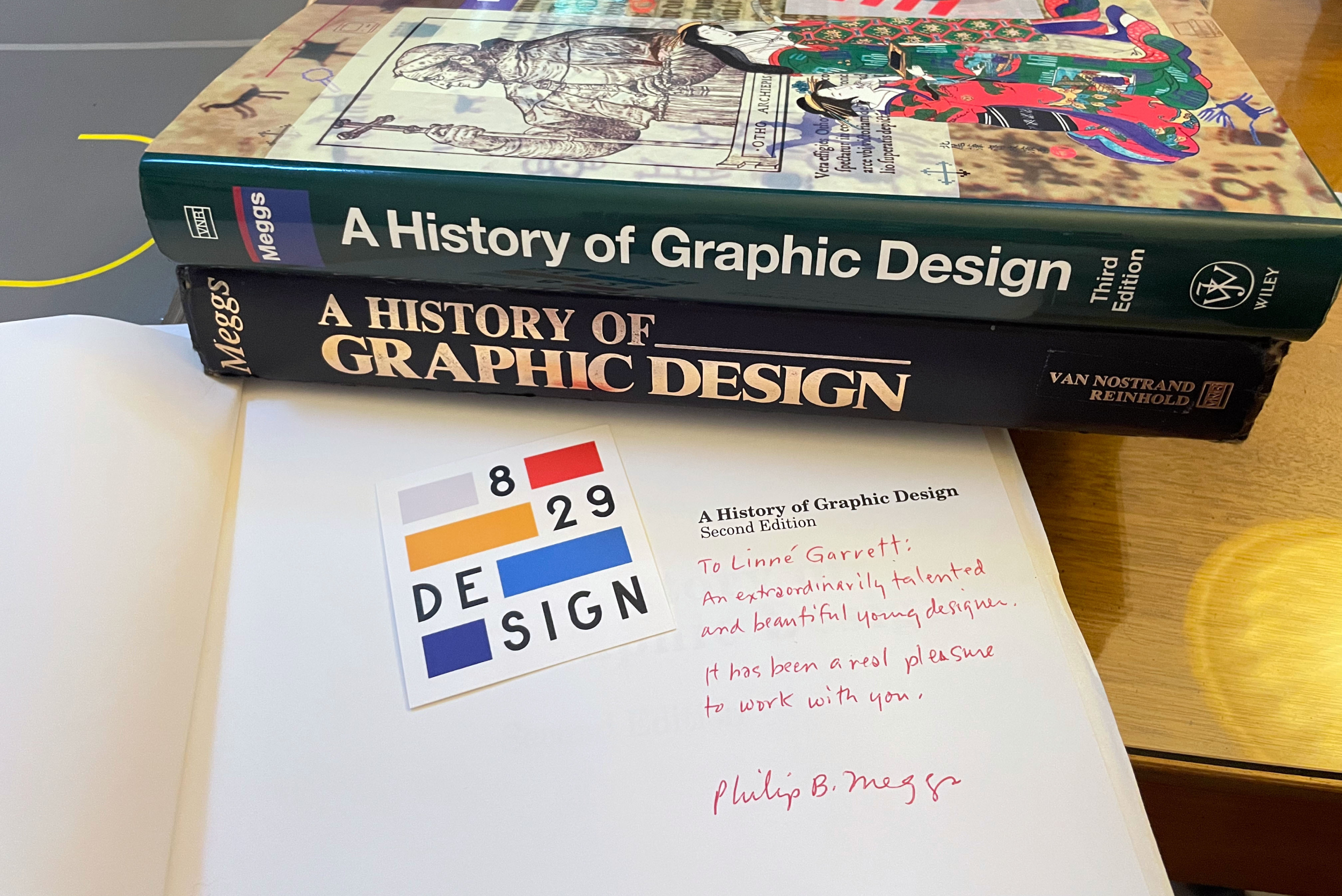
Remembering Philip B. Meggs in the Age of AI
There are teachers who instruct, and then there are teachers who reorder the way you see. Philip B. Meggs was the second kind. He didn’t just teach me what to look at. He taught me how to look, and I’ve been looking that way ever since.

From 1989 to 1991, I was a Communication Arts student at Virginia Commonwealth University. Most of my days were spent in the Pollak Building. It was old and well used, and those of us in art and design loved it anyway. Maybe we loved it because of that.
That building is where I took Phil’s design history classes. I also took typography with Rob Carter, who co-wrote Typographic Design: Form and Communication with Phil and Ben Day.

I always sat up top, in the back row, looking down toward the podium so I could see everything. Phil stood at the podium with the slides projected on the wall behind him, and I don’t remember him ever sitting down. He’d put a slide up, pause, and let us sit with it before he said a word. Then he’d talk about it in a way that made you look again and ask what you were really seeing.
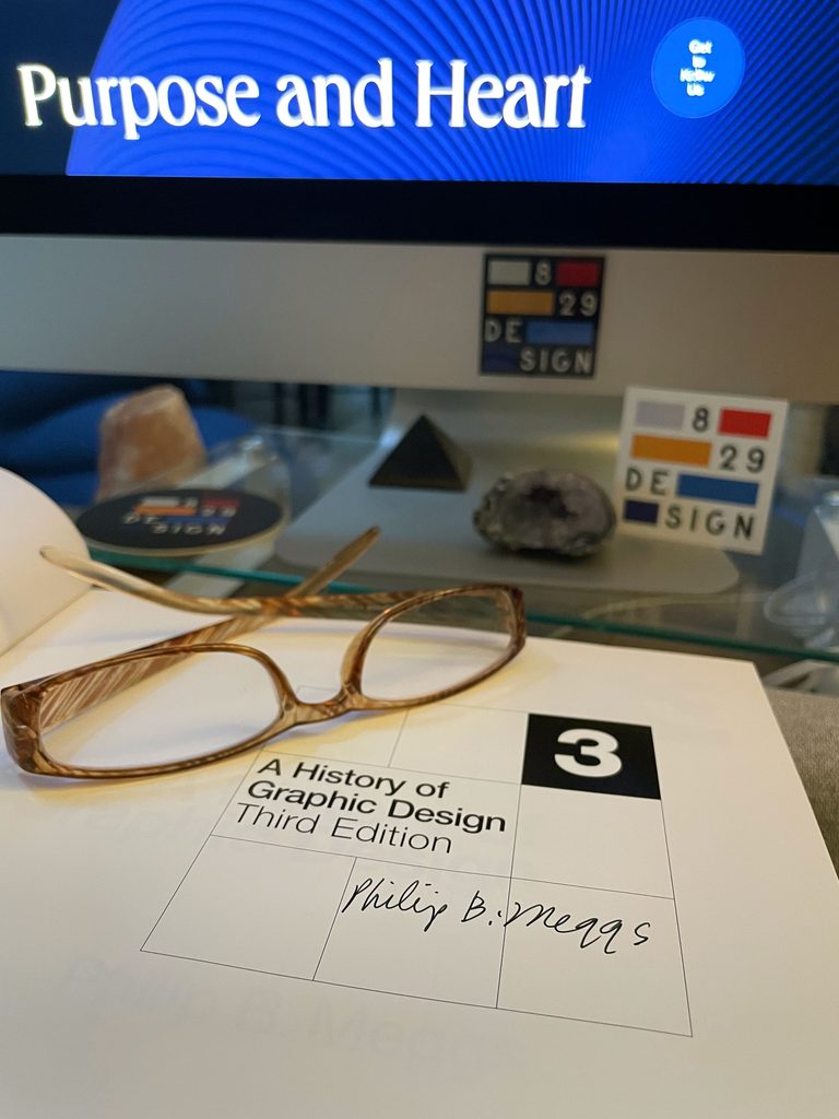
He was kind, gentle, and scholarly, and his classes were fun. They changed my career. They showed me what graphic design really is, and what it takes to be, as Phil wrote when he signed one of my books, a “red hot designer.”
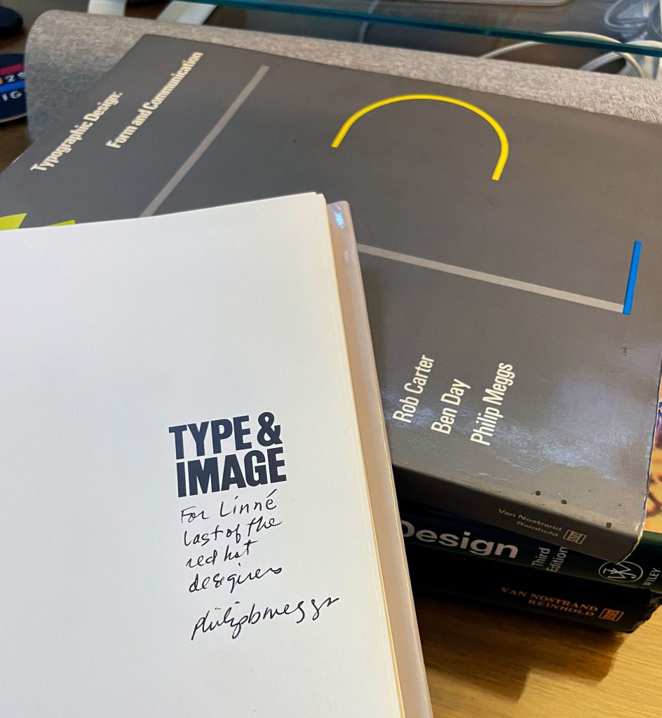

More than thirty years later, AI can generate a logo or a layout in seconds. I keep coming back to what he taught in that room, and I often wonder what he’d make of all this.
Choosing vs. selecting
What I took from his classes, more than any single fact, was the habit of asking why. Why this form, and not another? What is it saying?
Here’s the example I use with clients today. Helvetica isn’t just “clean.” It carries an idea: information should arrive without emotion or history attached. You can agree with that idea or not. But if you pick Helvetica without knowing it makes that claim, you haven’t made a choice. You’ve made a selection.
That difference between choosing and selecting shapes how I work. Choosing means you know your options and what each one says. Selecting means you took what looked right. The first is design. The second is operating software.
That’s what typography in branding comes down to: whether the letterforms say something on purpose, or just fill space.
The tools change. The obligation doesn’t.
Phil came to type honestly. He started his career at 16, hand-setting metal type after school, and grew to love the typefaces and letterforms he printed.
In his history of graphic design, Gutenberg marks a turning point. When Gutenberg printed his Bible in the 1450s, he modeled his type on the finest handwriting of his day, so the printed page could stand beside the best handwritten ones. Every great type designer after him, from Garamond and Caslon to Baskerville and Bodoni, answered the same question in their own way: what does the written word deserve?
Phil loved to share a line from the author Michael Crichton with his students, as his daughter Elizabeth recalls in her piece about her parents’ library. Without history, Crichton wrote, you don’t know anything.
“You are a leaf that doesn’t know it is part of a tree.”
— Michael Crichton
The way Phil taught it, a student in Richmond in 1989 was joining that same conversation, one more leaf on that tree. The tools had changed. The obligation hadn’t.
His classes also showed a pattern that keeps repeating. A new tool puts type in everyone’s hands. A flood of careless work follows. Then the people who understand the craft set the standard again. Desktop publishing did exactly this in the 1980s. Suddenly anyone could set type, and for a while almost everyone did, badly. The designers who did well weren’t the ones who refused the Mac. They were the ones who brought real knowledge to it.
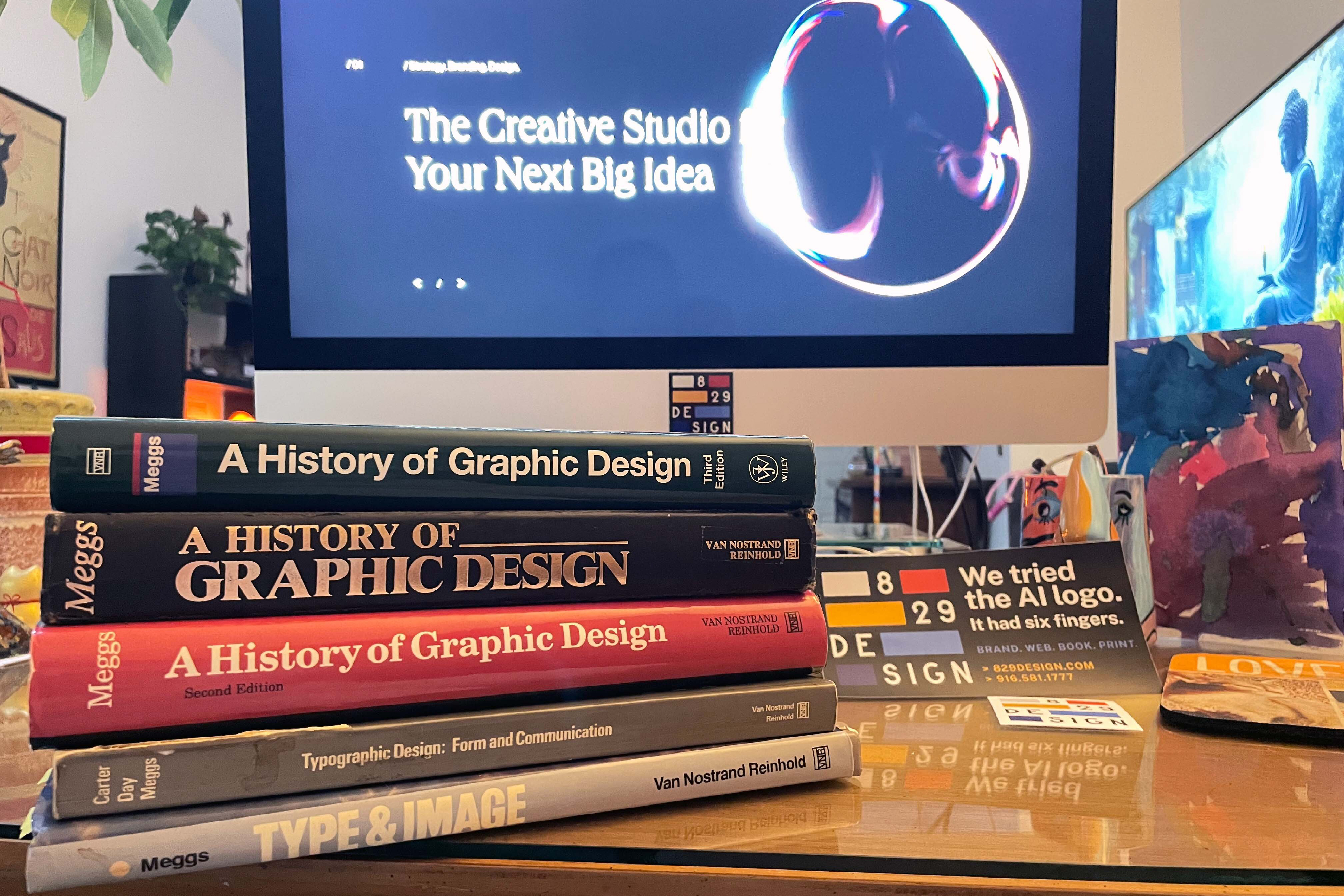
AI is the same pattern on a much larger scale.
What AI can and can’t do
AI can produce something that looks like good design, fast. It has seen more type specimens, posters, and book pages than any person ever will.
What it hasn’t absorbed is the reasoning. It knows what Garamond looks like, not why Garamond spaced his letters the way he did. It has every leaf and none of the tree. For a brand, that gap is everything.
When Paul Rand designed IBM’s visual identity, every choice, from the letterforms to the stripes, said something deliberate about what the company stood for. Massimo Vignelli and Bob Noorda’s New York subway signage did the same. Those weren’t style decisions. They were positions.

Many brands today pick type the opposite way: choose something safe that offends no one. But a typeface always says something about a brand, whether anyone meant it to or not. Safe says “we didn’t think about it.” And left to itself, an AI tool will usually hand you safe.
So can AI replace designers? It depends on what you think the job is. If design means producing something that looks finished, much of that is already automated. If design means knowing why, and being accountable for the choice, then no.
Nearly every new design technology has been called a revolution. The real revolution was always in the letters, and in knowing why they look the way they do. That’s the part the machines, and the people building them, forgot to generate.
What I think he’d say
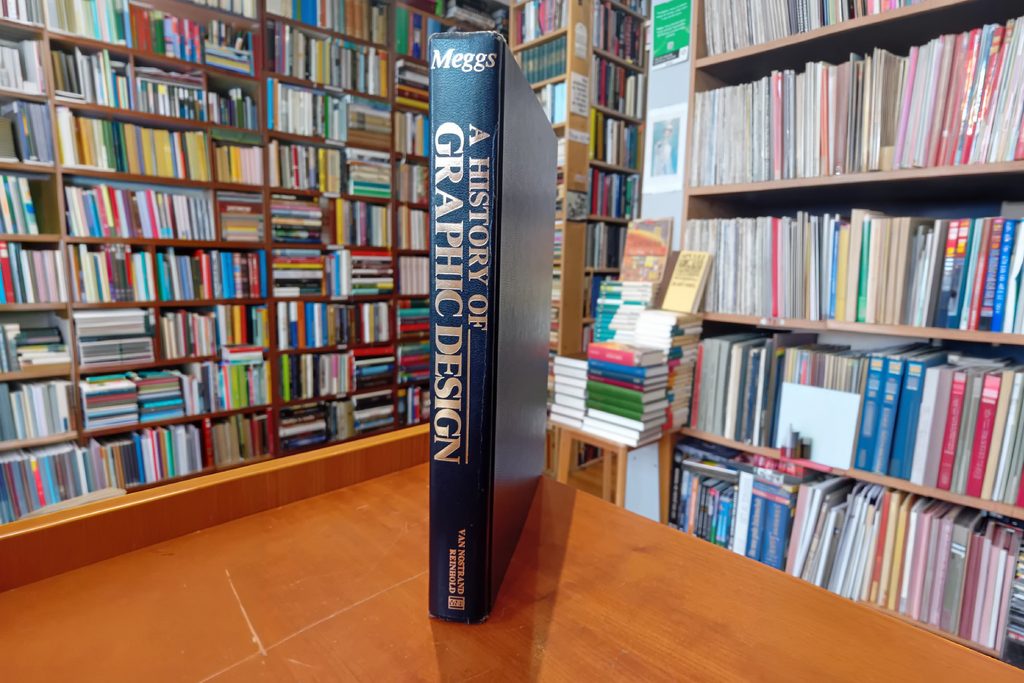
Phil died in 2002, long before any of this. A History of Graphic Design lives on, carried forward in later editions by Alston Purvis. Still, I’ve often wondered what chapter Phil would have written about this moment if he were here to write it himself.
I won’t pretend to know. But I have a guess, because I know what he taught.
I don’t think he’d panic. He had seen new tools arrive before, and he’d put this one in its place in history. He’d be concerned, because he always was when the culture chose the easy thing over the right one. And I think his answer would be the same as it always was: learn the history, understand what you’re choosing, and hold yourself to the standard.
That standard matters more now, not less. Clients can generate a logo before they ever call a designer. Social feeds are filling with images no one actually made. Companies are trimming creative teams and asking software to fill the gap. In that world, the designer’s value is shifting from making things to judging them: knowing which of fifty generated options is right, why it’s right, and what it will say about a brand five years from now.
That judgment is the future of graphic design. It’s also exactly what Phil spent his career teaching.
The letter
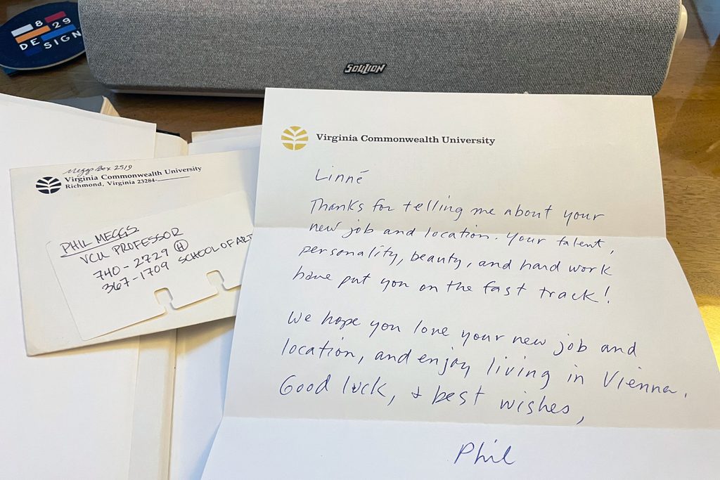
Early in my career, working as an art director in Washington, D.C., I wrote to Phil. I wanted to stay in touch. I told him how much I’d enjoyed his classes, what I’d learned from him and from studying A History of Graphic Design, and all about my new job.
I didn’t expect him to write back. He did, and I was thrilled.
That was Phil: kind, and generous with his knowledge and his time, even for a former student who simply wanted to say thank you.
Understanding why design works the way it does can’t be downloaded. It has to be earned in a classroom, from a teacher who believed it mattered.
I was lucky enough to be in that room: up top, in the back row, learning how to see.
— Linné Garrett, VCU Communication Arts and Design, Class of 1991
One Brand. Many Channels. One Consistent Visual Language. One Unified Experience.

You’re in a busy market. People rush past. Hawkers shout for attention. Amid the chaos, something catches your eye—not a face, but a familiar hairstyle, jacket, or walk. You recognize them instantly.
That’s visual consistency.
Brands need the same kind of recognition. Whether it’s your website, social media, packaging, in-store signage, app, or emails—your brand should be unmistakable, even in a crowded digital space.
This is where visual brand consistency becomes essential—it helps your audience instantly recognize and trust your brand, no matter where they encounter it.
It’s not just a creative choice. It’s a strategic decision—a tactic to connect with your audience at every touchpoint where they see, interact with, and experience your brand.
If your look changes across channels, you dilute familiarity. You create fragmented versions of your brand that compete with each other.
Visual consistency builds recognition and strengthens your brand image. It gives you one coherent identity customers can spot at a glance.
Your multi-channel branding need
A Salesforce study says that 72% of customers engage with brands on several channels. eBay Advertising UK’s research highlights a shopper’s interaction with a brand through six touchpoints and the importance of a seamless and consistent experience on all these channels.
What do these statistics show?
The importance of multi-channel branding. Your brand can’t stay in one place—it must travel to meet customers at different touchpoints. Think of it like a book: each chapter is a new station where your brand stops to engage.
Now, if you change your tone, messaging, fonts, voice, layouts, graphic elements, or logo on every channel, the audience is lost.
But if you maintain visual consistency, they recognize and engage with you. This is how you can converse with them and build familiarity and comfort, which, ultimately, leads to trust.
This blog emphasizes the significance of such visual consistency in building trust and increasing conversion. We also explore the common inconsistencies and essential elements of a visual brand identity system that brand managers and design teams must know to reap the benefits of visual brand consistency.
What happens when you maintain visual brand consistency
Where is your brand present?
- Websites
- Social media platforms
- Mobile apps
- Newsletters
- Stores
- Events
- Outdoor displays
- Print materials
This multi-channel presence helps you reach customers at every touchpoint—and reinforce your brand message.
Why visual consistency matters across these channels:
- It builds a mental “memory map” of your brand—your colors, fonts, and logo become instantly recognizable.
- Recognition turns into recollection, helping customers remember your message and build deeper connections.
The benefits of multi-channel visual consistency:
- Customers recognize, remember, and distinguish your brand from competitors.
- Consistency in visuals signals consistency in product or service quality—building trust.
- A clear, unified look helps customers understand your value and why they should care.
- It eliminates confusion and boosts confidence in buying decisions.
- Ultimately, it nudges customers to choose you over competitors.
Don’t underestimate this. Without consistency, your brand creates noise—not harmony.
Problem: Visual inconsistencies that weaken your brand
Just like inconsistent workouts lead to poor fitness, inconsistent brand visuals weaken your identity. Here’s where brands often stumble:
1. Logo misuse
- Using distorted or varied logo versions across platforms causes confusion.
- When your identity shifts from place to place, customers question your reliability.
2. Mismatched fonts and colors
- Imagine a playful neon-colored Instagram feed, a serious black-and-white brochure, and a minimal, colorless website.
- The result? A fragmented identity. No single version feels like “you,” and customers can’t recall your brand.
3. Inconsistent layouts across web, social, and print
- Your platforms should speak the same visual language.
- When layouts and tone clash, your message gets diluted. Engagement drops. Trust erodes.
In short: inconsistent visuals = confused customers = lost conversions.
Solution: Creating a bulletproof visual identity system
The inconsistencies are due to siloed efforts. Consider the visual consistency across different channels and elements as a single system. When you connect them, you create a seamless brand experience for customers.
It is like a jazz band. Different instruments follow the same rhythm to connect and create soulful music.
Your brand’s visual identity system should include these essential elements:
A robust brand style guide
No—it’s anything but boring.
It is an essential piece of paper or two to guide you on using all visual elements that help you communicate with your target audience. The guide must include points on visual, textual, and verbal elements (logo, colors, fonts, voice, images, etc.) and their application (like templates). It helps maintain brand consistency across different channels, facilitating higher brand recognition and recall.
Templates and centralized assets
A great way to have a visual identity system is the use of templates, centralized assets, and design tokens across all channels. Digital Asset Management (DAM) tools guarantee the same DNA in all your visual elements, be it slide decks, social graphics, or videos.
Cross-channel integration
Your branding channels do not work in silos. You must link them for a better impact on the audience. Manage cross-channel integration and cross-department collaboration to effect this. Your Instagram carousel must lead to your website, your newsletter must link to your blog, and your packaging must have the website link.
How does it help?
The audience grows from passive viewers to active participants. They act. They take a step towards your brand.
Storage, version control, and accessibility rules for design elements
Beyond defining layouts and design elements, it’s crucial to set guidelines for storage, accessibility, and version control. A centralized repository ensures everyone can access assets when needed, while designated team members manage updates and versions efficiently.
Real Brand Example: Aramid Technologies
Who?
A digital transformation expert in the supply chain industry, Aramid Technologies sought a strong brand identity and market positioning. Their goal was to clearly communicate their value proposition and growth potential to attract both investors and customers.
What did we do?

829 DESIGN met these goals with a tailored brand strategy, including:
We developed Aramid’s inaugural website—an entirely new digital presence that positioned the brand as a revolutionary change-maker in supply chain management. (Note: The current version of their website is not our work and looks significantly different.)
Our work included:
- A website built around compelling storytelling and intuitive user interface design.
- Meticulous, engaging visual design elements to spark investor interest and resonate with target audiences.
- An extended color palette that added depth and sophistication to the brand’s primary colors.
- Cohesive, immersive brand experiences across advertising platforms to establish a strong, consistent foundation.
Result?
The unified visual identity and its consistent execution across channels gave Aramid meaningful momentum in the market. The company went on to secure USD 2 million in seed funding, saw a notable increase in brand engagement, and improved conversion rates.
Are you ready for your visual identity markers?
Visual consistency is how your audience sees you, remembers you, and trusts you. Your brand elements—logo, colors, tone—remind customers of your story and promise.
Building this consistency isn’t easy. You may face:
- Unclear brand guidelines
- Legal or compliance constraints
- Fragmented visual efforts across teams and platforms
But overcoming these challenges pays off. You’ll earn trust, communicate clearly, and create a recognizable identity across the entire customer journey.
Think of your customer’s path: they discover your brand on Instagram, research you on your website, buy through your app, and revisit you through emails or packaging.
Stay consistent across these channels, and you’ll turn scattered touchpoints into a seamless journey—and first-time buyers into loyal advocates.
Ready to go from visual confusion to brand cohesion?
Connect with us and bring your brand’s vibe back into focus
The Loyalty Link: Why Brand Strategy is the Secret to Retention in 2025

Has your business hit the wall? Done everything, but still no change in results? The product/service is top-quality, but still, customers never return?
Stop where you are. Shift your focus from the product/service to your brand experience. For this, you need to go back and rework your brand strategy.
A brand strategy defines the personality of a business. How it looks, sounds, writes, listens, and behaves. Even how you, as a business, make your customers feel falls under brand strategy. It can include your communication with the audience, their perception of you, and their final experience with your offering.
Speaking in Gen Z lingo, brand strategy is the vibe your business gives off to people around you. It can be professional, friendly, empathetic, cold, or just transactional. When people connect to this vibe, they become loyal to your business and return whenever they need your product/service.
Don’t you keep going back to people you vibe with? Keep visiting the same café whose ambiance and food attracts you? Keep watching the same travel YouTube channel because you like the information, photography, and the approach. The same is the case with brands.
To help you build this vibe, we explore how your brand strategy links with customer retention and loyalty. We discover the brand strategy essentials that can help you retain customers and make them your loyal fans.
Brand strategy converts one-time buyers into loyal fans
Brand strategy is like a personality. If you like a person’s way of speaking, dressing, communicating, and behaving, you stay in contact with them. In the same way, if you like a brand’s personality, you stay in contact with them by becoming a brand fan and loyal customer.
But the brand needs to make an effort to make itself likeable. This is possible with:
- Familiarity and consistency in all messaging and customer communications
- Stand for the values, commitments, and assurances that are promised to deliver
- Unforgettable experiences customers expect at all possible customer touchpoints
These brand experiences make customers feel seen, heard, understood, and appreciated. It leads to developing your brand identity and market positioning, based on which customers trust you and become your loyal customers.
Do you know 28% of customers become brand loyals after consistent branding across all channels (SAP Emarsys’ research)? Moreover, 88% of customers return to a trusted brand. (Deloitte research).
Brand strategy enhancements bring customers back for repeat purchases
Customers do not like it when brands do not pay attention to them, address their pain points, give timely updates, provide seasonal benefits or discounts, etc. And what do they do? They churn and shift to another brand. Customers come back if you keep providing consistent, positive experiences and engagement across all touchpoints.
Your brand strategy needs to do the WORK here to bring back customers – how, which ones, when – it all depends on you.
It must be like a gardening plan. You know when to water, how much to water, what to plant, how to grow, which season to grow which crop, etc.
Your brand strategy must:
- Be clear about its uniqueness, offerings, and value delivery
- Align with the values of the target audience
- Stay consistent in voice, looks, behavior, and messaging across all channels
- Deliver exceptional experiences to solve customer problems
- Be personalized to make customers feel valued and more than transactional data points
Just as we gravitate toward people who understand us, we return to brands that reflect our values and preferences.
Proper nurturing with loyalty programs, value-driven products/services, community engagement, and personalized experiences improves customer retention.
Wish for customer loyalty and retention?
Focus on these aspects
How does the dating scene play for a person? You make an exceptional first impression, then talk and listen to build a connection. You go the extra mile to keep the relationship exciting. But before all this, you determine your desired feature list and make your identity and values attractive.
Brand strategy involves the same elements.
Ideal customer definition
You can’t please them all. Not everyone will use your product. So, focus only on your ideal customer. Define it clearly and make everyone in the team understand it. Niche down as far as you can. Then speak to them. The rest will follow.
A strong foundation
What is your brand standing on? It must have a clear purpose, a futuristic vision, a problem to solve, a mission, and a few values it won’t compromise. This is your foundation, which you must be confident about and communicate well to others.
Visual and verbal identity
Here comes the first impression, which involves your logo, website, packaging, designs, graphics, and tone of voice. Attract your customers with these, and voila, you’ve made the first confident move.
Customer-centric messaging
Your customers are attracted, but you need to communicate with them. Tell them about yourself, listen to their stories, and share your lives. Your taglines, marketing campaigns, storytelling, social media content, and designs make this possible. Value them, appreciate them; they will do the same by showing their loyalty.
Emotional connection building
Emotional bond takes time and needs nurturing. Keep on your promises and improve customer experiences. Share some real-life stories of founders, brand stories, and vulnerable situations. Your consistent efforts can help build a place in their heart.
Brand Positioning
Consistency builds reliability. If you confuse customers, they alienate themselves. So, keep your messaging consistent across all channels to build a positive, strong, and unique brand image in their minds. Customers develop brand affinity and make repeat purchases if you are consistent and clear.
Additional customer delights
Special people need special attention. Invest in customer delight if you want loyal customers and you see that element in them. Loyalty programs, interesting packaging, and exceptional experiences – all are necessary to keep the relationship alive and exciting.
A brand strategy case study with a positive impact on loyalty and retention

829 DESIGN’s complete brand build for The Road Home Law
The Road Home Law is a non-traditional law firm with expertise in post-conviction legal services. They wanted a unique brand identity unlike any other legal firm. They wanted their customers to trust them, consider them as a friend, and approach them with legal problems. When The Road Home Law approached us, they were starting from ground zero—no logo, no visuals, no identity, no brand.
That’s where 829 DESIGN stepped in.
We created a complete brand strategy to show what the Road Home Law is, what its world is, and what it does. Based on an understanding of their why, who, and how, our strategy blueprint included defining the:
- Defining their mission, vision, and values
- Crafting a unique value proposition
- Clarifying their brand purpose, identity, and positioning
- Creating detailed target audience personas
Once the strategy was placed, we moved into the specifics. We created Stylescapes to give an idea of the brand’s tone, mood, and aesthetics. Then we proceeded with fonts, colors, logo, typography, brand collateral to create a living space for the brand. Based on these factors, the brand’s digital home – a one-page website was built to reflect what they stand for and engage with the audience.
All these aspects of the brand reflect uniqueness, confidence, boldness, legal aesthetics, and transformative vision.
Now, clients are building trust with The Road Home Law because they emotionally connect with them. Clients get the much-needed hope for transformation, empathy, and an optimistic vibe from them.
This is how we build brilliant brands at 829 Design from nothing to unforgettable.
Brand strategy already in place?
Use these best practices to fine-tune
You know the deep connection between brand strategy and customer retention and loyalty. If you wish to level up, you can do the following:
- Find out the problem areas. How? Conduct regular brand audits.
- Make every interaction fruitful. How? Communicate your values, promise, and vision in all your customer messaging.
- Build on emotion. How? Personalize each customer experience.
- Make your messaging consistent. How? Align marketing, sales, and support teams on one single emotion.
- Listen to customers. How? Ask for their feedback and act on it.
- Humanize your customer relationships. How? Educate, empower, guide, and stay connected.
Let’s build your brand’s next chapter
Building customer loyalty and retention is not easy. It requires significant effort. Especially in terms of your brand strategy. You can focus on creating memorable customer experiences, a unique value proposition, and consistent brand messaging.
Customers remember you, build a connection with you, and are happy to deal with you. They return to you again and again for your value offering. This is how you score a goal to reach your business goals.
Don’t want your customers to leave you?
Give them more than just a product or service.
Share stories, build connections, and enhance experiences.
Let’s talk about crafting your brand strategy
Your Brand Is Giving You Hints: Notice Them Before It’s Too Late

Ever notice a strange symptom and brush it off? Once, twice, maybe even three times? Then suddenly, you’re facing a serious health issue.
Brands work the same way.
Your brand whispers before it shouts. A dip in engagement. A sudden drop in website traffic. Customers forgetting your name. These are not random occurrences—they’re red flags.
Brand audits are your regular check-ups. They help you catch problems early before they spiral into lost market share, decreased ROI, or a full-blown identity crisis.
As customer preferences, competition, and market dynamics shift, a brand audit keeps you aware and responsive. It often leads to a brand refresh strategy—revitalizing your identity, improving relevance, and strengthening your market position.
If you’re a founder, marketer, CMO, or brand manager, you already know the drill. You know how important it is to detect these signals before they become blind spots. This guide walks you through the brand audit process so you can act before your brand loses traction—or worse, becomes forgettable.
Notice When Your Brand Speaks:
Why You Need to Listen
Imagine a brand, Retailer X, that started strong with impressive conversion rates. But then the decline starts. The team has gone all in and made efforts across all angles, but what’s the result? A drop in visitors, conversions, and social engagement.
Time for a reality check.
It’s likely not just a tactical issue. Either X no longer resonates with its audience, or it misunderstood what they wanted all along. A brand audit helps pinpoint the root cause—low retention, unclear messaging, weak emotional connection, quality lapses—whatever it may be.
At its core, a brand audit helps you evaluate your brand from multiple angles: insider, customer, competitor, investor, and the broader public. It uncovers:
- How the market has shifted and how you’ve responded (or haven’t).
- Strengths and weaknesses within your brand experience.
- Market opportunities and challenges that inform future strategy.
- Whether your current positioning still aligns with your long-term goals.
- Your audience’s evolving preferences and expectations.
Depending on what surfaces, this might mean refining your messaging or completely rethinking your target audience, positioning, or visual identity. It’s not always about drastic change—but it is about realignment.
In short, your brand audit is your alarm clock. The earlier you wake up, the better your chance to shift, sharpen, and survive.
Core Brand Signals You Must Hear
What does your brand look like (Visual Identity)
Your brand’s visual identity—its logo, colors, and design—tell a story at first glance. It speaks volumes—before anyone reads a word and includes:
- Logo
- Website design
- Social media assets
- Packaging
- Brochures & emailers
- Advertisements
- Merch and collateral
Do these elements feel cohesive across platforms? Are they aligned with your mission and personality—or do they feel disjointed or outdated? Do they tell a story or are they just random signs?
Even minor visual tweaks—a modernized logo, simplified color palette, or consistent imagery—can significantly boost brand recall and trust, improve engagement, and lead to better customer loyalty.
What does your brand sound like (Verbal Identity)
Your brand’s voice and tone shape how people relate to you. Does your messaging sound robotic or real? Warm or cold? Confident or confused?
You can identify this from the brand’s:
- Voice & tone
- Messaging across channels
- Taglines & slogans
- Language style
- Naming conventions
Consistency builds brand personality. Done well, it can drive emotional connection, loyalty, and authority in your space. So, make these elements consistent, warm and welcoming, real, clear, unique, and from the heart.
What people say about your brand (Customer Perception)
This is where the truth comes out. Ever wondered what your customers truly think about your brand? Key questions to answer:
- What do they like and dislike?
- Do they trust your brand?
- Would they repurchase?
- Are they satisfied with the experience and value?
- How do they feel engaging with you?
Use surveys, interviews, reviews, sentiment analysis, testimonials, and social media feedback. Your customers’ voices are your biggest brand clues.
How strong is your digital footprint?
Your online presence is the most visible part of your brand. Your digital footprint includes:
- Website UX and SEO
- Social media content and engagement
- Digital campaigns & ads
- Online reviews & reputation
- Newsletters, blogs, videos, and other content
- Trust badges, security seals, partnerships
Audit for:
- Visibility: Are you showing up in the right places?
- Consistency: Does your online identity match your brand strategy?
- Engagement: Are customers interacting meaningfully?
- Competitiveness: How do you stack up against others in your industry?
Your digital footprint is often the first and only impression someone gets—make sure it reflects who you really are.These touchpoints should leave a strong impression and help shape a positive brand image.
How to Conduct a Brand Audit That Works
Inspecting the visual and verbal identity, customer perceptions, and digital footprint is essential. A thorough audit starts with listening—to everyone. And, it all starts with research.
Talk to those who live and breathe your brand every day—Employees. Customers. Partners. Vendors. Leadership. Each offers a unique lens.
Ask everyone:
- What’s working?
- What’s not?
- Where can we improve?
- Where are we headed?
When you gather these perspectives, the real picture emerges—not just of how your brand is seen, but how it’s felt.
Then, examine your brand assets—your visuals, messaging, web presence, and more. Look for patterns.
Do they align or contradict each other?
Are they sending the signals you want to send?
Are they working or undercutting your goals?
Customer data and feedback is your goldmine
Aligning with your customers means knowing:
- What do they think about you?
- What do they want from you?
- What do they expect next?
Social comments, reviews, DMs, complaints, and survey feedback—these are not just noise. They’re directional signals. Answering these three questions gives you insight into how your customers perceive your brand. So, tap into feedback, reviews, social media comments, complaints, and anything your customer says about you.
Comparison isn’t just healthy—It’s necessary
Just like comparing notes with peers can spark new ideas, analyzing your competitors can reveal untapped opportunities for your brand.
Ask yourself:
- What are they doing better?
- What are they doing differently?
- What are they doing worse?
This kind of analysis helps you uncover:
- Missed opportunities you can seize
- Gaps in the market you can fill
- Ideas to differentiate your brand meaningfully
You don’t need to copy your competitors—but you do need to understand them. That understanding is what allows you to build a true competitive advantage.
Your Brand’s Growth is One Audit Away
Think of a brand audit as your annual wellness check—because your brand’s health deserves it. Talk to the people who matter: customers, employees, partners, and anyone impacted by your brand. Ask what’s working, what’s not, and what could be better. Listen carefully.
This isn’t just a checkbox exercise. It’s how you uncover what’s strong, what’s slipping, and what needs attention before it becomes a real issue.
Yes, there’s a lot to manage. But your credibility, customer trust, and market position are too important to leave to chance.
Take action before your brand goes quiet. Before it fades. Before the signals stop showing up.
Brand audit = pivot, polish, perform
A brand audit isn’t just a task—it’s a reset point. It gives you the insight to:
- Refocus your strategy
- Strengthen customer connections
- Rebuild or refresh your identity
- Adapt with confidence
More than anything, it proves that your brand is listening, evolving, and staying relevant in a constantly shifting market.
Don’t wait for your brand to get lost in the noise.
We’ll help you listen, adapt, and lead.
Start your custom brand audit today.
Swag Strategy:
Why Branded Merch is Your Marketing MVP

Does your brand have swag?
Today, we’re going to discuss how custom branded merchandise can elevate your brand. Whether you’re a startup carving out your niche or a seasoned business reinforcing your presence, custom swag is an invaluable tool in your marketing strategy. These tangible representations of your brand not only promote your business but also create memorable impressions with your audience. From everyday essentials to standout luxury items, each piece acts as a vibrant ambassador for your brand.
Imagine each piece of swag as a walking billboard, reinforcing brand recognition and building customer loyalty. Branded merchandising is about building brand buzz, leaving a lasting mark, and winning hearts (and loyalty). Giving away branded goodies isn’t just a nice gesture either; it builds relationships. People love receiving useful stuff for free—and they’ll go bananas for your brand when it’s presented with a fun twist! Studies show that promotional products create a positive impression and keep your brand top of mind. It’s a win-win!

Here, we thrive on thinking and designing outside the box. Think of business cards for example—imagine handing out a sleek, sturdy metal card that not only looks impressive but also feels substantial—it’s like presenting a piece of your brand’s soul.
Ready to elevate your swag game and make your brand the MVP? We’re excited to chat about your brand and how we can bring your vision to life. Reach out to us to create custom merch that doesn’t just grab attention but also sparks conversations.
Let’s make your brand unforgettable.
Transform your brand’s swag into an MVP (Most Valuable Promo) today!
Top Influencer Marketing Platforms to Explore

Influencer marketing has become a vital strategy for brands looking to connect with audiences in meaningful ways. With many platforms available, finding the right one for your needs can be a game-changer. Here are some top influencer marketing platforms to explore:
- Influencer Discovery: Look for platforms that offer robust tools for finding influencers who align with your brand’s values and audience. These tools often include detailed metrics and filters to help you identify the best matches.
- Campaign Management: Effective platforms provide features for managing campaigns from start to finish. This includes tools for tracking performance, managing content approvals, and analyzing results to optimize your strategy.
- Analytics and Reporting: Comprehensive analytics help you measure the impact of your influencer partnerships. Look for platforms that offer detailed insights into engagement, reach, and ROI to ensure your campaigns are successful.
- Ease of Use: User-friendly interfaces can make a big difference in how efficiently you manage your influencer marketing efforts. Choose a platform that simplifies the process, from influencer discovery to campaign execution.
For a deeper dive into the best influencer marketing platforms available, check out the detailed guide. Whether you’re just starting out or looking to refine your strategy, these platforms can help you maximize your influencer marketing efforts.
The State of UX in 2025
A love letter about change
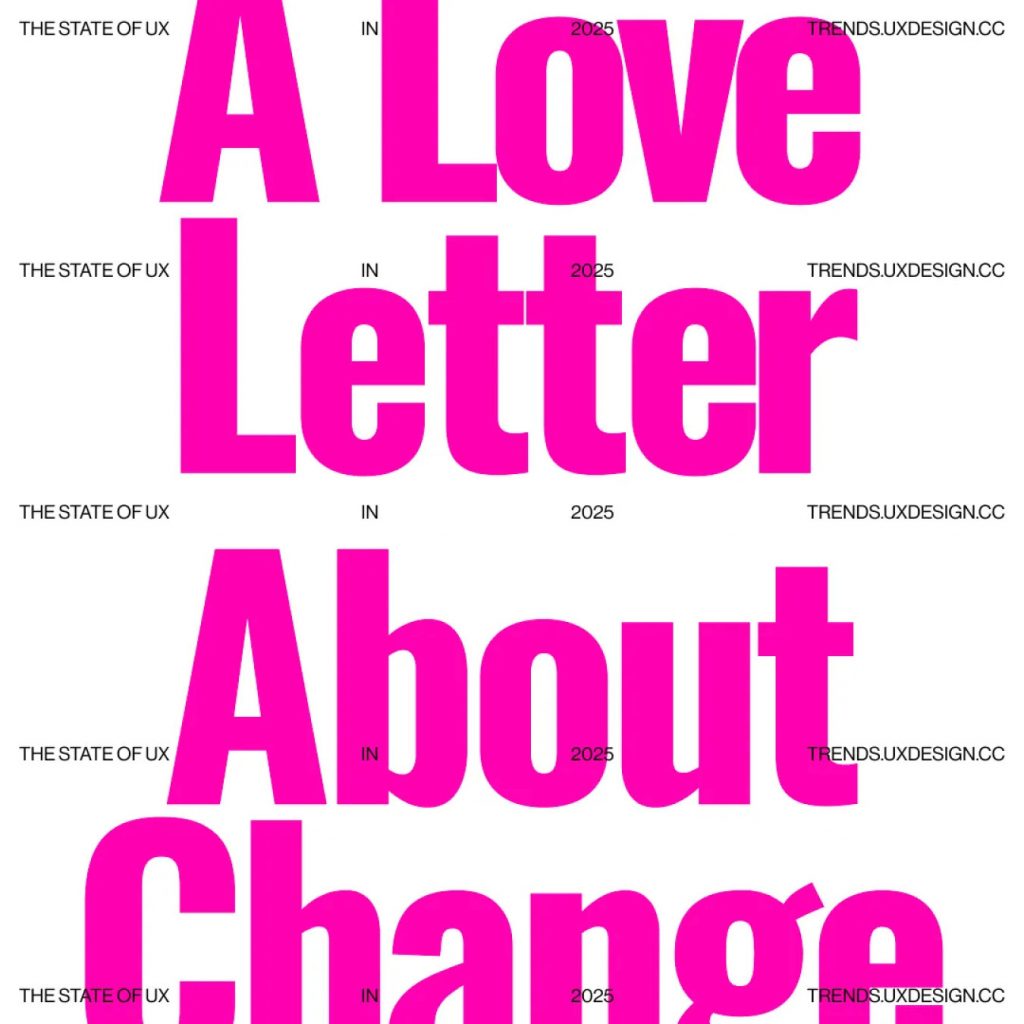
Things have been feeling differently for a while. That UX buzz, that peak we hit in the late 2010s, has faded. Historically, designers have always aimed to exert vast influence within their organizations, guiding the creative vision and making critical decisions that shape the product. That reality simply doesn’t feel palpable anymore when you look at the state of UX more broadly. UX is increasingly a byproduct of business objectives, not the driving force.
The Great Design Handoff
What we have started to witness this year is a fundamental shift in responsibilities and a transfer of design control from designers to a complex network of algorithms, automated tools, and business stakeholders.

We’re handing our designs to Figma while it trains its AI. It’s right there in the fine print you accepted when they launched their new AI features this year, because you also accepted Figma as the most convenient tool there is. Some say these AI design tools will put us out of a job; others say they’ll just make us faster. Trying to pick one single lane is lazy thinking. Arguing that AI will only replace the mechanical part of our job is shortsighted. [1][2][3][4][5][6] Very soon, AI-powered tools like Figma, Vercel, Canva (and many others) will change everyone’s perception of who is equipped to design, how long design takes, and—inevitably—how much design is worth paying for. [7][8][10][11][12][13]

We’re handing our design systems to growth teams so they can squeeze every last penny out of customers. We’re optimizing our flows for clicks, not clarity. We stopped building tools and started building engagement traps. [14][15][16][17] While in the past UX had a certain aura of care for users, in 2024 we are bluntly following the numbers. In many companies, the pursuit of growth is overshadowing the pursuit of meaning. [18][19][20][21][22]

We’re trading empathy for algorithms. Personalization has gotten so complex that it’s now out of human control, and can lead to echo chambers, warped perspectives, and consequences we’re unable to predict. We’re slowly swapping user research for automated A/B tests, and gradually letting the data make decisions on our behalf. [23][24][25] We could be choosing to create software that is local-first, more private, and more thoughtful. Still, we’re choosing to build for the machine—not for each other. [26]

We’re shipping new products before they’re even ready. Look at the AI hardware fiasco in 2024, or at all the half-baked AI features in our enterprise products—broken promises everywhere. Products don’t have to be ready for prime time because, over the last decade, we convinced ourselves we got to “fail fast,” “test and learn,” and “lean-UX” our way out of tight timelines. Which is a cynical subversion of all the foundational UX principles we claim to adhere to. [27][28][29][30][31]

We’re shifting our focus from good design to organizational politics. Increasingly, designers spend most of their day (and energy) in meetings talking about everything other than design, getting “stakeholder alignment”, and “balancing out user and business needs.” Products are launched because someone needs a promotion. Timelines are built around someone’s performance review or company reports. [32] [33] [34] [35] [36] This year, layoffs felt like a constant threat, and in many ways, the focus shifted from doing great work to just holding onto our jobs. [37] [38] [39] [40] [41] [42]

We’re dumping half-baked thoughts on Linkedin, hoping for the recognition we don’t get at work. This year, the lack of job security also made designers double down on our “online presence”, in an attempt to remain relevant within their network. We’re writing catchy Linkedin posts to please the algorithm; we’re making our thoughts more polarizing than they need to be. There’s no place for longer-form discussions or nuanced back and forth. We’re building echo chambers, not communities. It’s easier to build an audience using controversy than real thought. [43][44][45]

We’re giving up on the dream of community-wide events, and we’re letting companies dictate the design agenda. While smaller events continue strong even post-COVID, we clearly haven’t found a sustainable model for design conferences at scale. IxDA couldn’t compete with the big budgets behind Figma’s Config and Adobe Max. Which means those few companies get to decide who talks about what in today’s largest design arenas. [46]
We’re teaching our brand voice to LLMs so they can communicate with our customers without our oversight. We’re choosing not to hire a photographer and to use AI-generated imagery instead. We’re choosing not to hire a voice actor, not to hire an illustrator artist.
“Just this one time because the budget is short.”
“Just to try it out.”
“Just because our competitor is doing it.”
You get the point.
On their own, these shifts might fly under the radar. But zoom out, look at the whole year, and the patterns start to emerge—giving us a glimpse of where Design is headed. These subtle changes have been impacting everything: our daily routines, what we produce, the tools we use, our career paths, and even our communities more broadly.
So, as designers,
how might we embrace change?
Read the full article here:
The State of UX in 2025: a love letter about change →
This article was originally published on UX Collective and written by Fabricio Teixeira and Caio Braga.
The State of UX in 2024

ENTER
LATE-STAGE UX
Much like late-stage capitalism, late-stage UX is characterized by its market saturation, heavy focus on financial growth, commoditization, automation, and increased financialization. Corporations exert significant influence over the economy and society, and designers can only push so far when advocating for user needs.
How can we navigate this landscape as designers in 2024?
This is the 9th edition of The State of UX report by the UX Collective: a critical look at our industry based on more than 1k articles published and shared with our 500k+ subscribers in 2023.
Read the article here: https://trends.uxdesign.cc/
LoCo Eats! An Annual Benefit Celebration Of Food & Wine

Embarking on a delightful journey for all food and wine enthusiasts, we’re thrilled to introduce LoCo Eats! A Charming Annual Celebration of Food & Wine!
The Restaurant at Patowmack Farms in Lovettsville, Virginia, sought our support for the launch of LoCo Eats! A Celebration of Food & Wine, and we at 829 DESIGN had the pleasure of creating a custom logo, website, and social media branding to spread the word.
LoCo Eats! was born from a desire to showcase the diverse culinary scene of Loudoun County. Bringing together chefs, farmers, and winemakers for a day-long celebration, the event allowed the local community to savor the flavors of regional restaurants. Plus, it gave back to the community by donating a portion of the proceeds to Mobile Hope, the sponsored charity.
This family-friendly event offered a day of fun activities and a feast for the senses, featuring exquisite cuisine from the region’s top chefs, perfectly paired with a variety of wines. A heartfelt thank you to The Restaurant at Patowmack Farms for the opportunity to raise awareness in the Loudoun County community, supporting local farmers and the commendable cause of Mobile Hope.


Amplify Your Brand Message to Craft an SEO-Optimized Press Release

Press Release SEO
In this era of digital dominance, a well-crafted press release has the power to shape perception, engage audiences, and drive traffic to your website. As search engine algorithms evolve, it is essential to harness the potential of SEO to ensure your message reaches the right audience and climbs the search engine rankings.
Are you curious to know how to maximize the reach and impact of your press releases?
Then you need to check out this article by Design Rush on Press Release SEO. In this article, they unravel the art of writing an SEO-optimized press release, exploring techniques and strategies to enhance visibility, garner media attention, and amplify your brand’s voice in the vast digital landscape. From keyword research to strategic formatting, this knowledge will equip you with the insights and practical tactics to optimize your press releases and establish a strong online presence.
Click here to access the article and unlock the secrets to successful Press Release SEO.
829 Selected As A Top Branding Agency In California

~ CELEBRATE GOOD TIMES, COME ON! ~
DesignRush has selected 829 as one of the
Top Branding Agencies in 2022
What an honor and privilege it is to be selected for a second time as one of the best branding agencies in California by DesignRush.
For 30 years, 829 has been viewing pivotal times of change as opportunity, leveraging design strategy to turn them into an advantage. We solve brand and business challenges purposefully and with an unwavering pursuit of great design. Our problem-solving, human-centric approach can help you define your brand, your brand experience and improve your brand strategy.
Through research, brand strategy and design, we create and revitalize brands, driving value through every interaction, by designing human-centered solutions for what matters most — to win over your customers. In doing so, we deliver rich brand experiences adaptable to any challenge, organization, experience, or medium.
If you are looking for a creative design agency to help grow your business, please get in touch and we would be happy to speak with you.
In the meantime, check out this great article on “How to Measure Brand Awareness”
Best Web Design Agency In CA – 2020

Top Web Design Companies In California
We’re excited to announce that 829 DESIGN has been ranked as one of the top-rated web design companies in California for offering high-quality web design and development services at DesignRush. We’re so honored to be included in this exclusive group.
A big shout out to all our clients – past & present – for helping us achieve this award. We’re grateful for your support! As experts in WordPress Design & Development, we love helping our clients successfully reach their business goals online by producing websites which not only attract the right audiences but also converts them into happy customers.
HAVE A PROJECT IN MIND THAT YOU’D LIKE TO DISCUSS?
LET’S START A CONVERSATION.
Get in touch (916) 581-1777
The State of UX in 2020

The State of UX in 2020
We are on the cusp of 2020 and what an iconic year this will be! The awesome and amazing folks at UX Design have spent tons of hours curating and sharing 2,411 links with 358,917 designers around the globe, and have come to identify a few of the trends our industry has been chatting about.
This is their fifth consecutive year publishing a trends report. If you have read any of their previous editions, then you will understand this is not an article about UI trends, but rather a more holistic analysis of UX Design as a discipline. The article covers all of the tools, methods, collaborations, career challenges, and how our community can make an impact on the world around us — one that we, consciously or not, have helped to design.
Here’s what to expect for UX in 2020.
Read the article here: The State of UX in 2020
Branding Par Excellence

According to DesignRush, we’ve been selected as one of the Top Branding Agencies in 2019.
We are thrilled to be named one of the best qualified branding agencies in Roseville, CA. Branding is one of our specialities and something we live and breathe at 829 DESIGN.
You see, your brand is the foundation of your company. It represents your company’s personality and is a promise to your customers. Branding is far more than the development of an icon or tagline. Branding creates the face and voice of your company; it drives communication strategies. A brand is worthless if it doesn’t connect with the right audiences in a relevant way. In today’s market, savvy companies are always evolving their brand strategies as the digital marketplace develops and changes, so make sure yours is up-to-date!
A great brand is actionable, compelling, and true. Two out of three won’t do. It must be a blend of all three. Give us a call at (916) 581-1777 or email us at he***@*******gn.com and let’s create something awesome!
The World Of Curated Branding

Have You Thought About a Curated Brand?
We have discussed branding quite a bit on our journal because it is the major touchpoint through which customers find you and keep finding you. It is your calling card in the business world. Many in the industry have been wondering where the logo will be going next. We might be looking at the beginning wave.
This week, we are bringing up a new angle on the traditional logo that might seem a bit far-fetched or intimidating, but it might just be genius.

What is a Curated Brand?
Have you noticed a few brands standing out lately? The age of consistent branding might be coming to a close. What will come next, you might ask? As Rory Macrae put it so well in his article: The age of the “Chameleon Brand” (loving this term!!).
In an age where everyone has their own customized desktop, cell phone, menu, and more, why should a brand appear the same to every eye? This is based on the same thinking that brings you the “share a Coke” campaign. Visually, the bottles are still very consistent with each other and the Coke brand, but each bottle is personalized in a very specific way.
Google fiddles with this idea with their doodles all the time – more specifically, every time your birthday rolls around and your google landing page is decorated specifically for you. A company that has been doing this for much longer is M&M. You have been able to get personalized M&M candies made for years! Same old recognizable chocolates but with your message stamped onto them.

Market Saturation
The market has become saturated with the same looks and feels. Not only that – we see giants everywhere, recognizable from a three-key jingle or a color. And they’ve caught on to it. So why do they need to plaster their logo across everything when its not needed?
We are gradually stepping away from the traditional logo and branding, approaching the idea that you can morph into whatever your customer wants to see. Spooky, huh? One example of this is Netflix and their specialized content. They figure out what you love and select cover art for all the other titles to be most attractive to you. They figure this out in sneaky ways.
Morphing Potential
What we are asking is: What if you could do that with your brand? How lethal would you be in your market? This might still be a few years out, but it is definitely worth talking about. What kind of morphing would your brand be able to cope with? It might be worth taking the time to make sure you have a “morphing potential” in your base brand. If there’s nowhere to go with it, it will not go far.

While we all fear change just a little bit…it is something that your business depends on. Your brand needs to be able to grow and change right along with your customers.
If you don’t have a chameleon brand, you might need to make some serious decisions. Here are some questions to help you figure out if your brand is flexible and dare I say…chameleon-y?
- Do I currently have a strong branding system to utilize?
(colors, typography, graphic style, mood, visual iconography, sound/music) - Is my brand translating well across all platforms, media and devices?
- Does my current logo remain strong when simplified?
Spread Your Wings, Darling!
Let’s give you some morphing power!
Just as a chameleon effortlessly adapts to its surroundings, your brand can seamlessly transform to meet every need with vibrant versatility. Whether you seek professional advice or wish to refresh your brand, you’ve found the perfect place to embark on a new journey. Start your transformation today!
Email us: he***@*******gn.com or call (916) 581-1777
The Dangers Of Sameness


We found an interesting article and wanted to share it with you, but we also wanted to translate it a bit and add our thoughts!
In a piece written by Tom Roach, he discusses the difference between distinctiveness and differentiation. While these two words might sound like the same exact thing, he discusses them as two separate schools of thought as it applies to marketing and branding.
Here is a link to the article if you’d like to read it yourself!
Breaking The Mold
The whole idea of this article was to bring to light the fact that we are all trying to run successful businesses. In order to do that, we sometimes take the mold that we found was successful for one business then we change it just slightly to fit us and make us “stand out” a bit (while still being safely inside that mold). This doesn’t work too well though because you aren’t being distinctively different. You are still one of the masses that are trying to sell toner or blenders or whatever else. There is a definite risk to stepping out of the mold, but the risk for those who remain one of the masses is greater.
As a business, you cannot risk NOT standing out. As Mr. Roach says in his article, “The idea of competitive advantage is intrinsically linked to difference. Which is why the marketing sections of business books always say the same thing – difference matters – and no marketing professors ever advocate sameness as a winning strategy.” (1)

$$$ Through Difference
Brands are more successful when they set themselves apart. They might even get a better price for a product that is only slightly different than their competitors. Why is that? Because they look different therefore they MUST BE different. Worth the higher price tag, obviously. “An analysis of actual prices paid (from the loyalty card data of 2400 shoppers for 79 brands) showed that shoppers paid 22% more for brands they find different and meaningful vs those they didn’t, with difference alone accounting for 40% of this on average.” (2, Brown Study).
How does one set their brand apart and make themselves seem more…more? Good question. I liked the way Tom Roach put it in his article. It’s not just a single smoking gun, it’s a culmination of several different things. It’s a catchy tagline, a certain ad campaign, or even a branding strategy that isn’t at all what one would expect in your line of business.

Not only does being different help you stand out in people’s minds, but it also helps predict sales in the future. “Brands which people score strongly for both meaning and difference grow sales around 8.2% better in the following year than brands which score poorly, with difference being responsible for at least 50% of the predictive power.” (3) This means that if you are different enough and have legitimate meaning behind what you’re doing and what your brand represents, you have a higher chance of being successful!
So, What Are We Saying?
- Always shoot for unsaturated markets.
- Break that mold and make a definite move towards individuality.
- Keep looking for ways to be different and show you are different through public face, public interaction, or a number of different ways.
If you are having troubles finding your way or you’re not sure how to start, begin by asking questions. Reach out to businesses that inspire you and ask what their secret is. Shoot your local experts an email by clicking HERE!
Definitely take a fine tooth comb to your business. Compare the visuals and websites to your level one and level two competitors. From there you can start deviating from the mold.

It’s time to stand out!
Worried about your company in a saturated marketplace?
We can help!
A Discussion On Color (Part 2)
Color Usage in Branding and Marketing
Thanks for joining us on our next discussion on color!
Now we all know that colors effect moods and emotions. They can trigger certain feelings when people encounter them. This makes it very important when selecting the right color or colors to go into your logo and identity.
But now we go a step further and say this: This can either make or break your brand.
WHATS YOUR STYLE?
Hopefully, when you got a logo designed they also provided you with mood-boards and color palettes. (This is our standard operating procedure anyways). When you go to make a new sign or a new package for that new amazing product, you need to always make sure that it is the same color that you were using. And no, we aren’t saying “Keep it purple,” we are saying “Keep it 29:C, 52:M, 0:Y, 33:K.” Trust us, people can tell when the color is a little bit off. This is why designers get paid as much as they do for big companies like McDonalds and Starbucks. Not only does it look nice, but little things like this help with customer trust.
The important thing to remember is that you are not forever doomed to use the same color. There are several ways to expand and utilize more or even adapt.
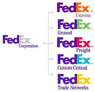
There are cases where the company logo has a series of colors that are used to distinguish multiple different facets of the company’s services. It is tricky because you have to balance the highly adaptive with remaining consistent and familiar. This example is brought to life perfectly in the FedEx logo.
MAYBE YOU FEEL THE OPPOSITE WAY?
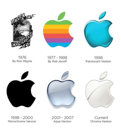
Good news: Some companies expand into other colors through logo updates, or decide to be rid of them altogether. This is a good choice for companies who are seeking a sleek minimalist look. Consistency is key but you don’t want to appear dated and stuck.
Color in brands is important when it comes to marketing and advertising as well. Some campaigns are based solely on a color like (RED). Remember your audience when marketing. Based on the gender of your audience, you might want one color over another. Use monochromatic for online ads, complimentary for more print media or to get more variety, and tri-colored ads to add sophistication and bold effect.
COLOR DOESN’T JUST PUT A PRETTY POP IN YOUR BRAND.
Wisely utilizing colors encourages reading by 80%. Not only that, but those readers will remember the material better! It draws the eye, enabling you to highlight key information and reinforce ideas. This is a good tactic for websites and layout design for when you just have a little too much copy. It helps to break it up and add some interest. Make sure to use colors that work with the brand color or that exist in the brand color palette. If that doesn’t work, it is also possible to theme your content (like a blog post) and make it specific to one color. But you have to keep that idea going and not leave an oddball standing alone. I guess thats the most important part – Commit to your idea and your vision.
We believe in intuitive design so we understand if you feel that in your gut something is right for your brand. If you have the option, always consult with a professional designer to ensure that your content and your marketing is clean, professional, and elevates your brand.
CREATING A SYSTEM
There are several ways to use a color in your brand, as we’ve said. There is a whole system that needs to be built and guidelines in place on the usage within your brand. Icons can be built to highlight statistics on a webpage or in a pamphlet, signage in your physical store can utilize your selected color or colors. Maybe your employees all have that same color of shoes?
We don’t want to stray off topic into clothing, but if you are curious about this, Google Starbuck’s employee dress code!
It’s far more complex than selecting a color and then plastering it all over the place. Luckily, there are experts in the field, ready to help!
Beautify Your Brand, Attract Customers.
Interested? Reach out today!
Email us: he***@*******gn.com or call (916) 581-1777