
Remembering Philip B. Meggs in the Age of AI
There are teachers who instruct, and then there are teachers who reorder the way you see. Philip B. Meggs was the second kind. He didn’t just teach me what to look at. He taught me how to look, and I’ve been looking that way ever since.

From 1989 to 1991, I was a Communication Arts student at Virginia Commonwealth University. Most of my days were spent in the Pollak Building. It was old and well used, and those of us in art and design loved it anyway. Maybe we loved it because of that.
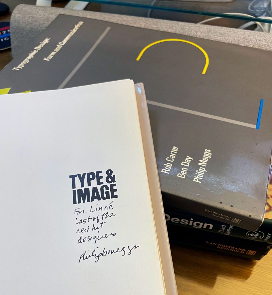
That building is where I took Phil’s design history classes. I also took typography with Rob Carter, who co-wrote Typographic Design: Form and Communication with Phil and Ben Day.
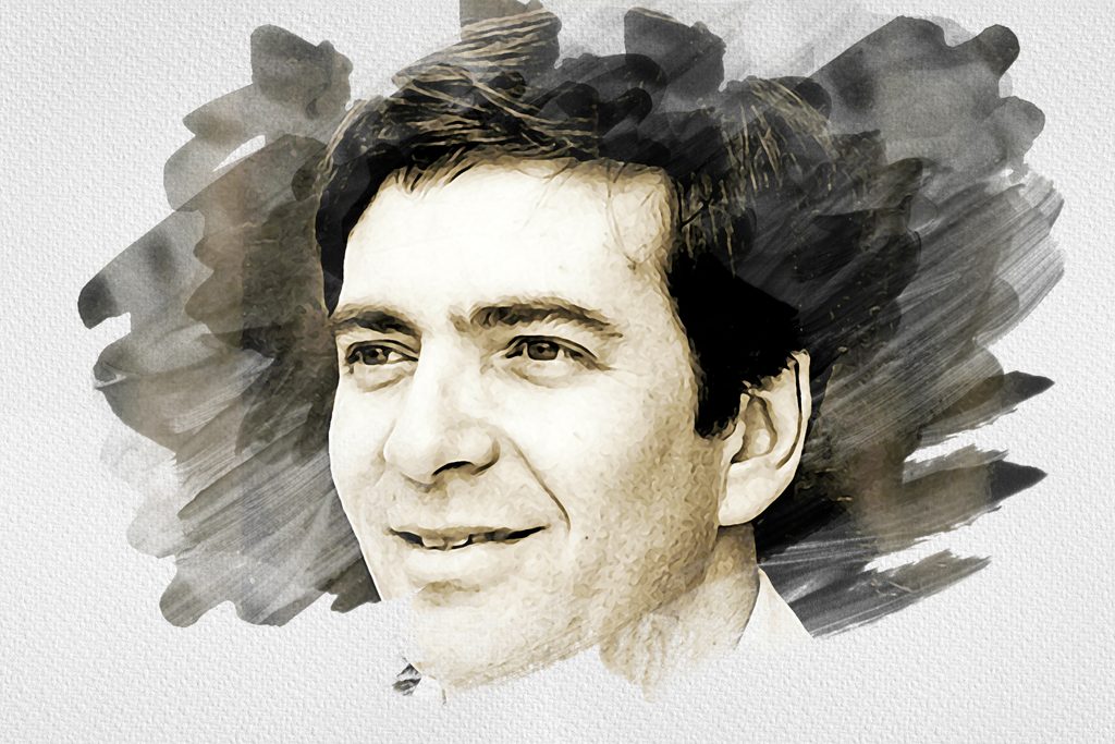
I always sat up top, in the back row, looking down toward the podium so I could see everything. Phil stood at the podium with the slides projected on the wall behind him, and I don’t remember him ever sitting down. He’d put a slide up, pause, and let us sit with it before he said a word. Then he’d talk about it in a way that made you look again and ask what you were really seeing.
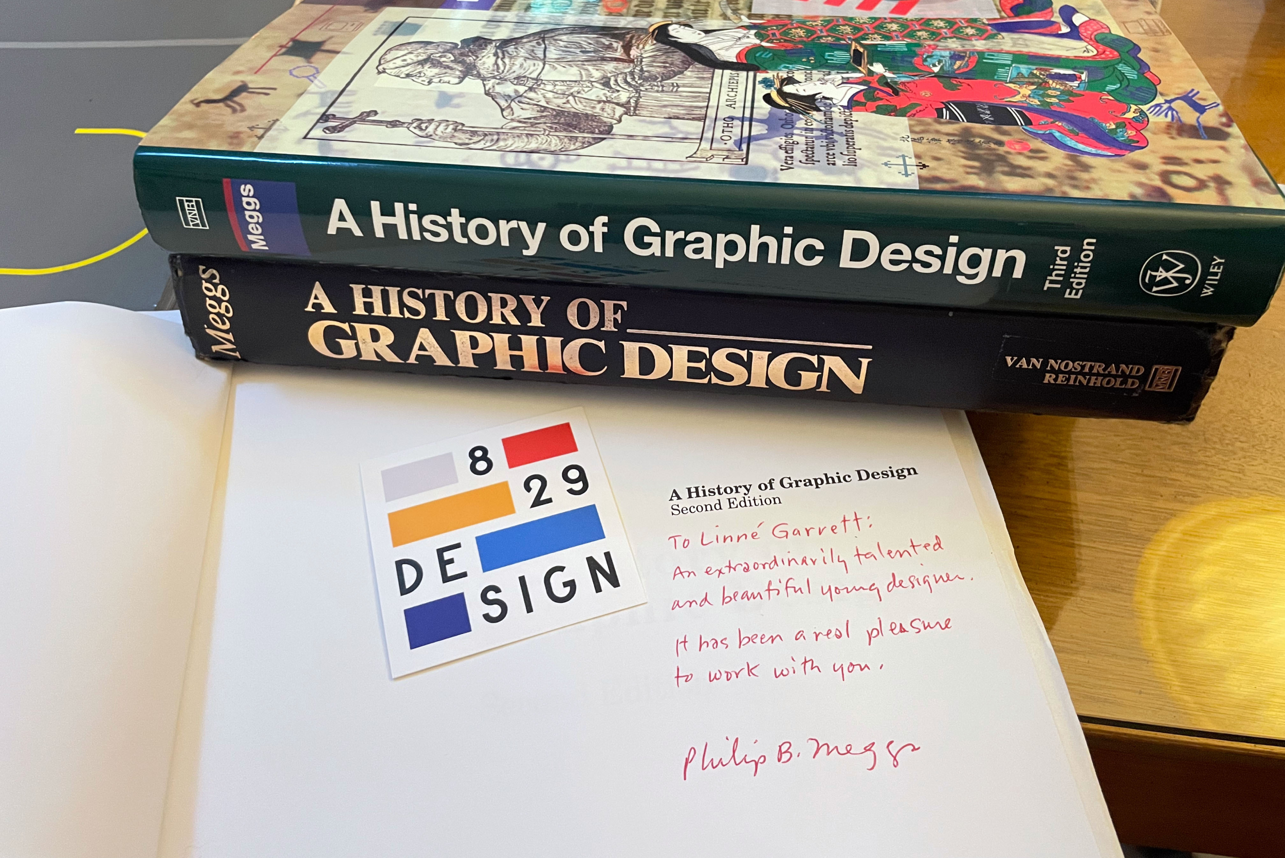
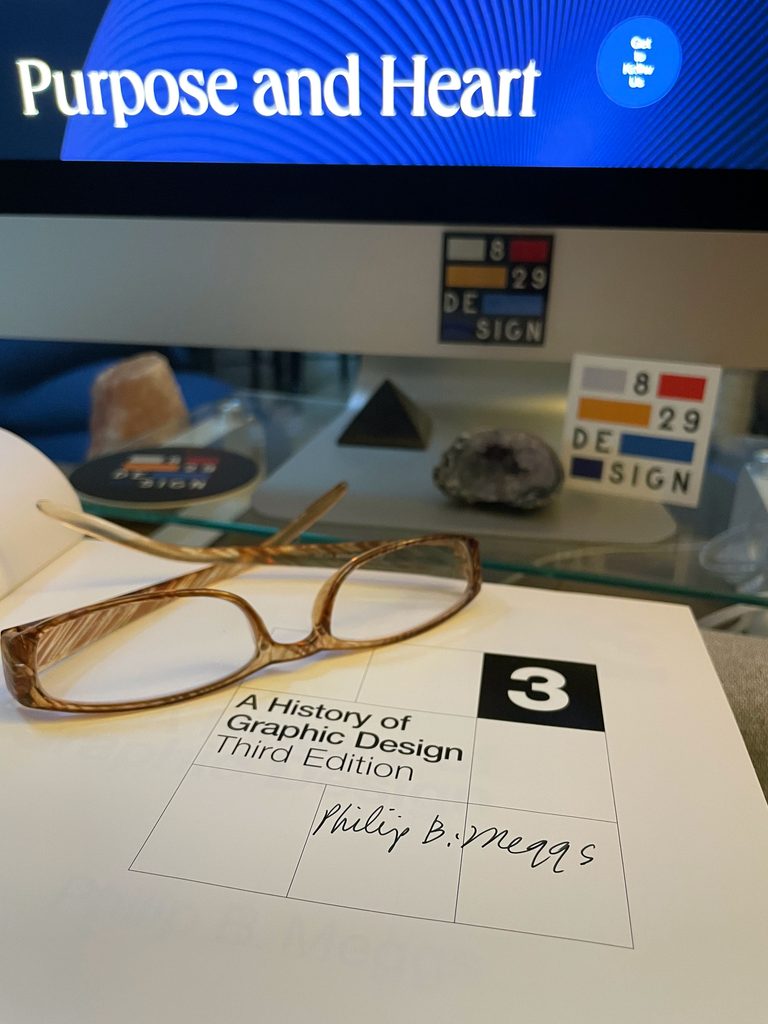
He was kind, gentle, and scholarly, and his classes were fun. They changed my career. They showed me what graphic design really is, and what it takes to be, as Phil wrote when he signed one of my books, a “red hot designer.”
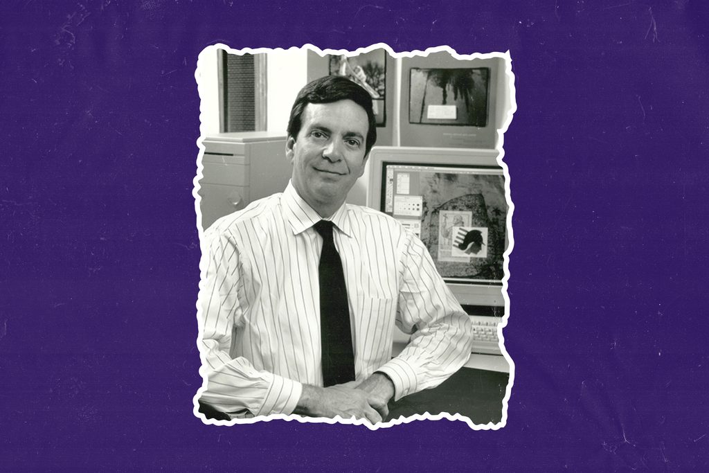
More than thirty years later, AI can generate a logo or a layout in seconds. I keep coming back to what he taught in that room, and I often wonder what he’d make of all this.
Choosing vs. selecting
What I took from his classes, more than any single fact, was the habit of asking why. Why this form, and not another? What is it saying?
Here’s the example I use with clients today. Helvetica isn’t just “clean.” It carries an idea: information should arrive without emotion or history attached. You can agree with that idea or not. But if you pick Helvetica without knowing it makes that claim, you haven’t made a choice. You’ve made a selection.
That difference between choosing and selecting shapes how I work. Choosing means you know your options and what each one says. Selecting means you took what looked right. The first is design. The second is operating software.
That’s what typography in branding comes down to: whether the letterforms say something on purpose, or just fill space.
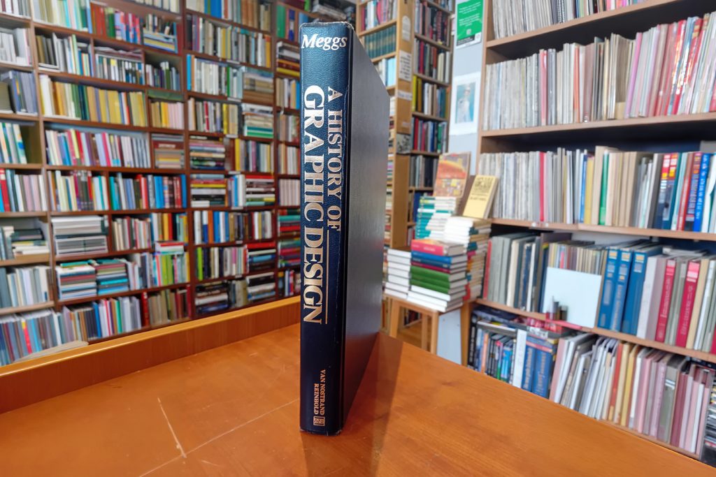
The tools change. The obligation doesn’t.
Phil came to type honestly. He started his career at 16, hand-setting metal type after school, and grew to love the typefaces and letterforms he printed.
In his history of graphic design, Gutenberg marks a turning point. When Gutenberg printed his Bible in the 1450s, he modeled his type on the finest handwriting of his day, so the printed page could stand beside the best handwritten ones. Every great type designer after him, from Garamond and Caslon to Baskerville and Bodoni, answered the same question in their own way: what does the written word deserve?
Phil loved to share a line from the author Michael Crichton with his students, as his daughter Elizabeth recalls in her piece about her parents’ library. Without history, Crichton wrote, you don’t know anything.
“You are a leaf that doesn’t know it is part of a tree.”
— Michael Crichton
The way Phil taught it, a student in Richmond in 1989 was joining that same conversation, one more leaf on that tree. The tools had changed. The obligation hadn’t.
His classes also showed a pattern that keeps repeating. A new tool puts type in everyone’s hands. A flood of careless work follows. Then the people who understand the craft set the standard again. Desktop publishing did exactly this in the 1980s. Suddenly anyone could set type, and for a while almost everyone did, badly. The designers who did well weren’t the ones who refused the Mac. They were the ones who brought real knowledge to it.
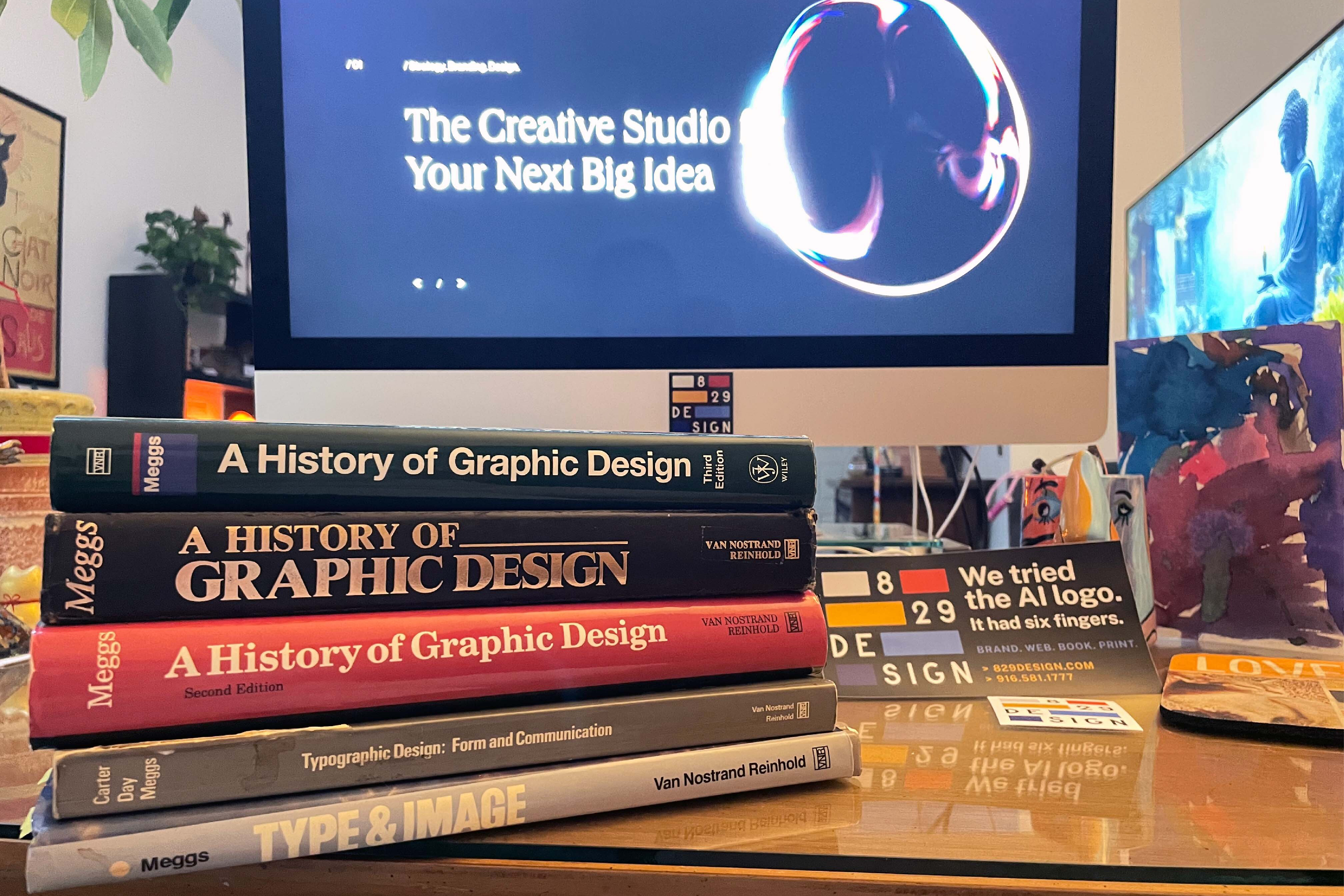
AI is the same pattern on a much larger scale.
What AI can and can’t do
AI can produce something that looks like good design, fast. It has seen more type specimens, posters, and book pages than any person ever will.
What it hasn’t absorbed is the reasoning. It knows what Garamond looks like, not why Garamond spaced his letters the way he did. It has every leaf and none of the tree. For a brand, that gap is everything.
When Paul Rand designed IBM’s visual identity, every choice, from the letterforms to the stripes, said something deliberate about what the company stood for. Massimo Vignelli and Bob Noorda’s New York subway signage did the same. Those weren’t style decisions. They were positions.

Many brands today pick type the opposite way: choose something safe that offends no one. But a typeface always says something about a brand, whether anyone meant it to or not. Safe says “we didn’t think about it.” And left to itself, an AI tool will usually hand you safe.
So can AI replace designers? It depends on what you think the job is. If design means producing something that looks finished, much of that is already automated. If design means knowing why, and being accountable for the choice, then no.
Nearly every new design technology has been called a revolution. The real revolution was always in the letters, and in knowing why they look the way they do. That’s the part the machines, and the people building them, forgot to generate.
What I think he’d say
Phil died in 2002, long before any of this. A History of Graphic Design lives on, carried forward in later editions by Alston Purvis. Still, I’ve often wondered what chapter Phil would have written about this moment if he were here to write it himself.
I won’t pretend to know. But I have a guess, because I know what he taught.
I don’t think he’d panic. He had seen new tools arrive before, and he’d put this one in its place in history. He’d be concerned, because he always was when the culture chose the easy thing over the right one. And I think his answer would be the same as it always was: learn the history, understand what you’re choosing, and hold yourself to the standard.
That standard matters more now, not less. Clients can generate a logo before they ever call a designer. Social feeds are filling with images no one actually made. Companies are trimming creative teams and asking software to fill the gap. In that world, the designer’s value is shifting from making things to judging them: knowing which of fifty generated options is right, why it’s right, and what it will say about a brand five years from now.
That judgment is the future of graphic design. It’s also exactly what Phil spent his career teaching.
The letter
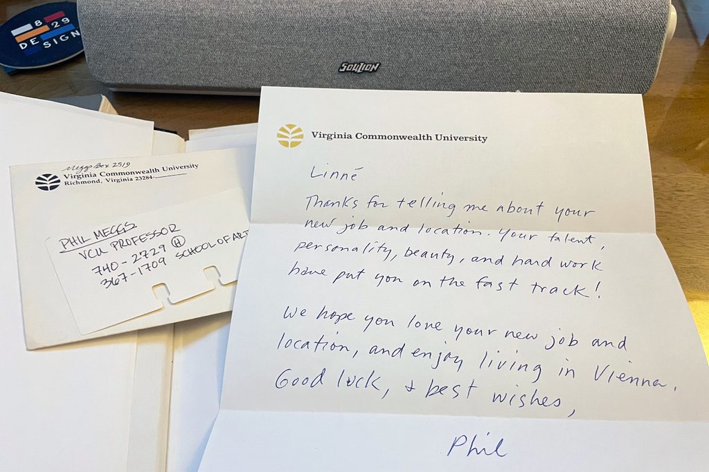
Early in my career, working as an art director in Washington, D.C., I wrote to Phil. I wanted to stay in touch. I told him how much I’d enjoyed his classes, what I’d learned from him and from studying A History of Graphic Design, and all about my new job.
I didn’t expect him to write back. He did, and I was thrilled.
That was Phil: kind, and generous with his knowledge and his time, even for a former student who simply wanted to say thank you.
Understanding why design works the way it does can’t be downloaded. It has to be earned in a classroom, from a teacher who believed it mattered.
I was lucky enough to be in that room: up top, in the back row, learning how to see.
— Linné Garrett, VCU Communication Arts and Design, Class of 1991