
/ The Website
Shape the brand to reflect TRICO’s expertise and their customer’s lifestyle and needs. Design a
modern visual identity, blending aesthetics with clear messaging. Craft messaging that encapsulates
premium service and peace of mind. Create a cohesive online experience that captures hearts and
earns trust.
Strategy
- Research
- Positioning
- Brand
- Platform
- Messaging
Experience
- Web Design
- Brand Collateral
- Branded Environments
As Aramid Technologies set sail on their mission to revolutionize global supply chains, they
recognized the pivotal role their inaugural website would play. It wasn’t just about establishing a
digital presence; it was a magnet for investors and new customers. Understanding the need for a
seamless blend of branding and functionality, Lonni Kieffer turned to us to bring Aramid and
SmartCert® to life online.
Our collaboration wasn’t just about building a website; it was about creating an immersive brand
experience that would captivate stakeholders, laying the groundwork for Aramid’s ascent in the
industry, culminating in their successful acquisition of $2 million in seed funding.
/ The Website
The art of crafting an unforgettable brand experience starts with strategic insight. We started with
brand strategy workshops with Tim and the TRICO team to shape the brand story—figuring out who they
are, who their ideal customers are, and how they all fit together in the brand ecosystem.
Identifying the needs of the TRICO customer base was pivotal in creating meaningful brand
touchpoints. Through various exercises, we got to know the TRICO customer and matched their needs
with the values and identity of the brand, ultimately leading us to positioning TRICO as the gold
standard in residential painting services—setting them apart in an overly saturated industry and
showcasing their true essence.
/ Brand Strategy
The art of crafting an unforgettable brand experience starts with strategic insight. We started with
brand strategy workshops with Tim and the TRICO team to shape the brand story—figuring out who they
are, who their ideal customers are, and how they all fit together in the brand ecosystem.
Identifying the needs of the TRICO customer base was pivotal in creating meaningful brand
touchpoints. Through various exercises, we got to know the TRICO customer and matched their
needs with the values and identity of the brand, ultimately leading us to positioning TRICO as
the gold standard in residential painting services—setting them apart in an overly saturated
industry and showcasing their true essence.
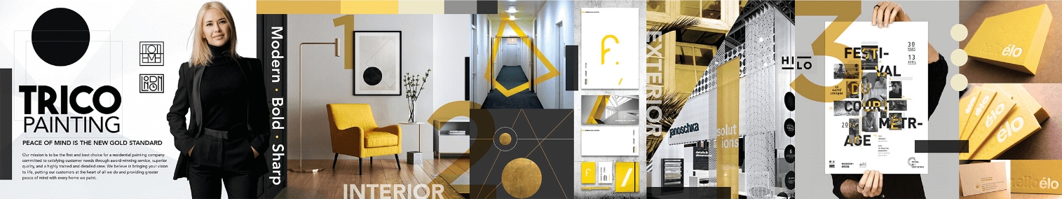
Stylescape 1: Goldfinger
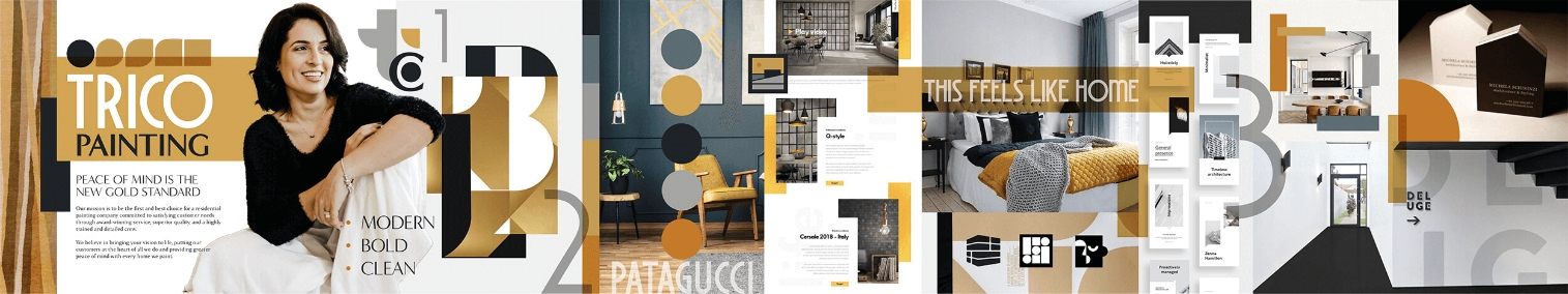
Stylescape 2: Patagucci
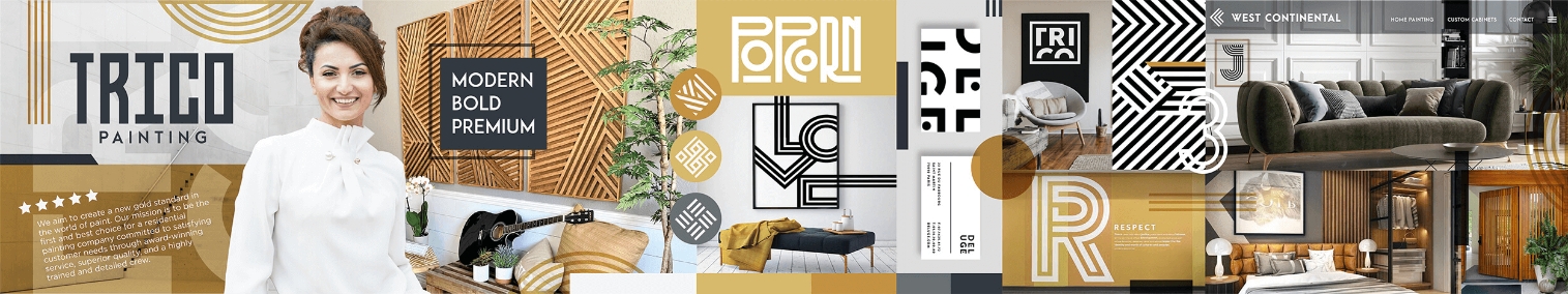
Stylescape 3: Golden Sunset
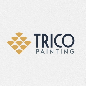
/ The Logo
We wanted for each logo option to embody the three core brand attributes: modern, bold, and clean.
While all presented options were suitable for the brand, the final choice hinged on the design style
Tim and the TRICO team envisioned as the primary focus. Ultimately, they were drawn back time and
again to the golden split-inspired wordmark, ensuring not only a visually striking design but also
the proper pronunciation of the company name.
-
Old Logo
-
Old Logo
-
Old Logo
-
Old Logo
FINAL LOGO SYSTEM
LOGO SYSTEM IN USE
/ The Style Guide
We knew Tim would be overseeing various projects and potentially collaborating with outside vendors
for merchandise design and other collateral. We also wanted him to feel fully equipped to
confidently represent the TRICO brand.
To ensure brand consistency and clarity, we developed an
in-depth style guide that covers everything and lays out exactly how to present the brand—from voice
and messaging, to logo usage and photography style.
/ Website Design & Development
Pulling it all together, we crafted a bespoke website to position TRICO as the leading authority in
residential painting services while staying true to the brand’s mission, vision, and core values.
Our objective was to ensure that the site stands out distinctly from other local painting
contractors, delivering a unique and unforgettable online experience.
The custom-built website features original photography, videography, iconography, and graphics—all
meticulously tailored to reflect TRICO’s identity and elevate the overall brand experience.
Additionally, we developed a custom color web form and personalized blog section to further engage
visitors and provide valuable resources and insights.
/ Digital Marketing & Advertising
Following the successful launch of TRICO PAINTING’s new website, our digital marketing teams kicked
into high gear, producing remarkable outcomes. Through targeted SEO strategies and ongoing
optimization efforts, TRICO PAINTING’s online presence skyrocketed. Their website climbed the ranks
on Google, capturing top positions for numerous industry-relevant keywords, totaling an impressive
6,854.
We also saw a steady increase in their Domain Authority (DA) further solidifying their online
authority. These achievements translated into increased visibility and brand recognition, driving
sustained growth in organic traffic and goal completions.
/ Happy Clients
“We couldn’t be happier with 829 DESIGN! When we reached out in early 2022 for a fresh website and a
revitalized image, we knew we needed something special to stand out. The team’s approach was just
what we needed. Over the course of several months of dedicated collaboration, we witnessed something
truly remarkable unfold.
The result? An absolutely stunning website and a brand makeover that surpassed all our expectations.
From the message to the aesthetics, every aspect perfectly reflects our value proposition in a way
that resonates deeply with our audience.
If you’re in the market for
branding, marketing, or website design that truly sets you apart, look no further than 829 DESIGN.
Their expertise, dedication, and attention to detail are second to none. Highly, highly
recommended!” Tim Flood — Owner
Tim Flood — Owner
-
indigo blue
-
chartreuse
-
turquoise
-
apricot
-
cym
-
blue gray
-
cool grey
-
cool white
/ Brand Colors
Utilizing Aramid’s established brand colors from their logo design, we expanded upon them by incorporating complementary colors into their primary palette. These hues are showcased in the diverse graphic motifs and gradients, adding depth and sophistication to their otherwise corporate palette.


