Swag Strategy:
Why Branded Merch is Your Marketing MVP
Does your brand have swag?
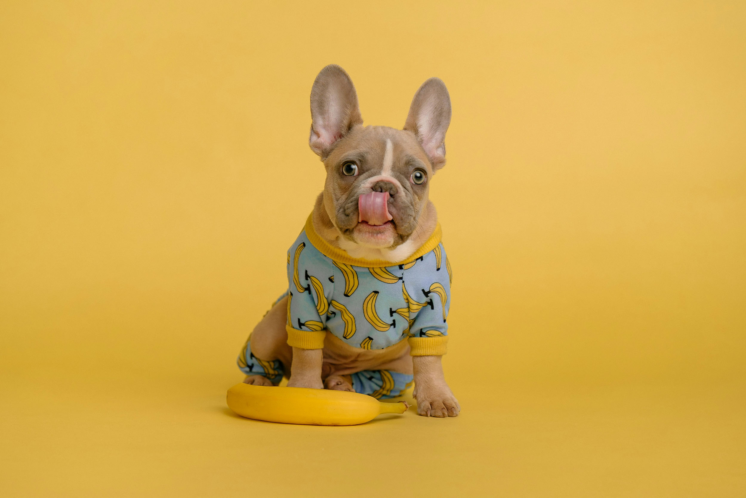
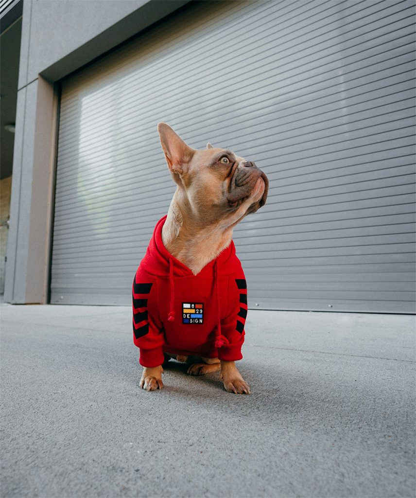
Today, we’re going to discuss how custom branded merchandise can elevate your brand. Whether you’re a startup carving out your niche or a seasoned business reinforcing your presence, custom swag is an invaluable tool in your marketing strategy. These tangible representations of your brand not only promote your business but also create memorable impressions with your audience. From everyday essentials to standout luxury items, each piece acts as a vibrant ambassador for your brand.
Imagine each piece of swag as a walking billboard, reinforcing brand recognition and building customer loyalty. Branded merchandising is about building brand buzz, leaving a lasting mark, and winning hearts (and loyalty). Giving away branded goodies isn’t just a nice gesture either; it builds relationships. People love receiving useful stuff for free—and they’ll go bananas for your brand when it’s presented with a fun twist! Studies show that promotional products create a positive impression and keep your brand top of mind. It’s a win-win!
Here, we thrive on thinking and designing outside the box. Think of business cards for example—imagine handing out a sleek, sturdy metal card that not only looks impressive but also feels substantial—it’s like presenting a piece of your brand’s soul.
Ready to elevate your swag game and make your brand the MVP? We’re excited to chat about your brand and how we can bring your vision to life. Reach out to us to create custom merch that doesn’t just grab attention but also sparks conversations.
Let’s make your brand unforgettable.
Transform your brand’s swag into an MVP (Most Valuable Promo) today!
A Discussion On Color (Part 2)
Color Usage in Branding and Marketing
Thanks for joining us on our next discussion on color!
Now we all know that colors effect moods and emotions. They can trigger certain feelings when people encounter them. This makes it very important when selecting the right color or colors to go into your logo and identity.
But now we go a step further and say this: This can either make or break your brand.
WHATS YOUR STYLE?
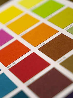
Hopefully, when you got a logo designed they also provided you with mood-boards and color palettes. (This is our standard operating procedure anyways). When you go to make a new sign or a new package for that new amazing product, you need to always make sure that it is the same color that you were using. And no, we aren’t saying “Keep it purple,” we are saying “Keep it 29:C, 52:M, 0:Y, 33:K.” Trust us, people can tell when the color is a little bit off. This is why designers get paid as much as they do for big companies like McDonalds and Starbucks. Not only does it look nice, but little things like this help with customer trust.
The important thing to remember is that you are not forever doomed to use the same color. There are several ways to expand and utilize more or even adapt.
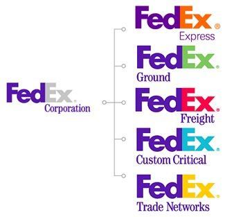
There are cases where the company logo has a series of colors that are used to distinguish multiple different facets of the company’s services. It is tricky because you have to balance the highly adaptive with remaining consistent and familiar. This example is brought to life perfectly in the FedEx logo.
MAYBE YOU FEEL THE OPPOSITE WAY?
Good news: Some companies expand into other colors through logo updates, or decide to be rid of them altogether. This is a good choice for companies who are seeking a sleek minimalist look. Consistency is key but you don’t want to appear dated and stuck.
Color in brands is important when it comes to marketing and advertising as well. Some campaigns are based solely on a color like (RED). Remember your audience when marketing. Based on the gender of your audience, you might want one color over another. Use monochromatic for online ads, complimentary for more print media or to get more variety, and tri-colored ads to add sophistication and bold effect.
COLOR DOESN’T JUST PUT A PRETTY POP IN YOUR BRAND.
Wisely utilizing colors encourages reading by 80%. Not only that, but those readers will remember the material better! It draws the eye, enabling you to highlight key information and reinforce ideas. This is a good tactic for websites and layout design for when you just have a little too much copy. It helps to break it up and add some interest. Make sure to use colors that work with the brand color or that exist in the brand color palette. If that doesn’t work, it is also possible to theme your content (like a blog post) and make it specific to one color. But you have to keep that idea going and not leave an oddball standing alone. I guess thats the most important part – Commit to your idea and your vision.
We believe in intuitive design so we understand if you feel that in your gut something is right for your brand. If you have the option, always consult with a professional designer to ensure that your content and your marketing is clean, professional, and elevates your brand.
CREATING A SYSTEM
There are several ways to use a color in your brand, as we’ve said. There is a whole system that needs to be built and guidelines in place on the usage within your brand. Icons can be built to highlight statistics on a webpage or in a pamphlet, signage in your physical store can utilize your selected color or colors. Maybe your employees all have that same color of shoes?
We don’t want to stray off topic into clothing, but if you are curious about this, Google Starbuck’s employee dress code!
It’s far more complex than selecting a color and then plastering it all over the place. Luckily, there are experts in the field, ready to help!
Beautify Your Brand, Attract Customers.
Interested? Reach out today!
Email us: he***@*******gn.com or call (916) 581-1777
A Discussion On Color (Part 1)

If you’re a local, you know we got a LOT of rain this winter!
What we designers love about the rain is that it comes with a great rainbow. So thats what we decided to discuss in this journal.
When people approach colors, they always gravitate to their favorites or to the one that speaks to them.
Important Note: Customers do the exact same thing.
We encounter colors all the time.
Out shopping you pick between the different colors of makeup or mugs. Maybe a certain pair of shoes you will request in a different color. Car shopping, clothes shopping, even food shopping! (Is an orange supposed to look this dark…?) Not just that though. Have you ever gone into a restaurant or a business and immediately felt as ease? Or maybe the opposite?
Next question: Did you look at the walls?
Many consumers don’t know this, but there is an entire psychology behind colors and the emotions they evoke. There is a good reason why so many social media sites use blue in their designs. It is trustworthy and professional. Color usage effects not just a logo, but the rest of the branding as well. We are talking poster designs, packaging, headers, and more.
For now we are going to stick to logos…branding will be the next part.
Is your goal to light a fire under the viewer, or are you trying to help them feel relaxed? That might be the decision between red and green. Even genders come into play with color. Did you know that men are more drawn to bold colors while women are happiest with softer tones?
What are the benefits of color usage in a brand?
Simple: memorability. Studies show that color increases brand recognition by 80%! Not only this but it might help pick you out of the crowd and make you more desirable to some.
Is there a brand out there that you associate with a certain color? I’m gonna challenge myself just for fun. See what you come up with!
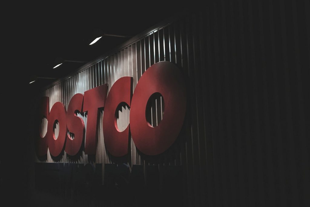
Red – Coca Cola
Blue – Facebook
Green – H&R Block
Yellow – McDonalds
Orange – Nickelodeon
Purple – Hallmark
Black – Nike
To jump ahead slightly: Color also helps add depth to your brand. If you are a company who’s goal is to help inspire kids to be more creative, you might want to consider orange. But if you are a whole foods company focusing on organic and natural ingredients: Green all the way!! The message is coded in – in the CMYK! We recommend having a selected color palette built when the logo is developed. From there, the branding can naturally evolve into something amazing!
ROYGBIV
Let’s get to it!
Keep in mind that the meanings and feelings brought on by colors often overlap and contradict. It is all in the execution of the usage. This is why its important to consult a designer near you 😉
Red
This is a color of passion. It can also also drive response and create action with its fiery warm tone. It communicates power, strength, and determination. There is a romantic and steamy side while also eliciting feelings of youthful playfulness.
Orange
This is a vibrant and rich color that often inspires creativity. Energetic vibes with the freshness of yellow while not straying all the way into the power of red. In this way, it is truly the color of change – positive change. It is balanced, often being associated with wealth, success, and high society. Orange can be incredibly vivid while also being soft and natural.
Yellow
She is the happiest of all the rainbow. The color of the sun itself, spreading positivity and optimism. It can be very warm, it is good to use for relationships and friendship. Feels clear and light. But beware, this color can also feel confusing and overbearing. It can catch the eye but then might not let you go again. People can find this color to be chaotic and annoying.
Green
Fresh, organic, natural, growth…all words that align themselves with this royal and rich color. Green has been rightly claimed by the natural world, giving the feeling of wholesome energy and fertility. Like yellow, there is a darkness that can make you feel jealous, sickly, and envious. But when used correctly, this is an honest and gorgeous color. Green has been used to stimulate hunger, sooth emotions, and make one feel strong and inspired. Green is a very well rounded color.
Blue
This is probably the most social color, stirring feelings of interaction and relaxation. Blue historically makes viewers feel serene and peaceful while also inspiring creativity and authority. It is also a cold color if you’re not careful. Trustworthiness won’t be lost is you chose to use blue.
Purple
Probably the most royal out of all the colors. This is historically rooted because purple was a notoriously hard pigment to obtain. Purple is dignified, powerful, and mysterious. Also closely associated to magic and fantasy. It is firmly etherial and powerful. Rich and regal, perfect for any brand wishing to become prominent in the eyes of the consumer.
White
Historically paired with purity and innocence, white is an excellent color to communicate serenity and goodness. It is a color of light and positivity. Probably best to be used with minimalist and simple branding.
Black
It goes without saying that this is a color of darkness. If purple was mysterious, this color is doubly so. Black isn’t always negative, but you have to be cautious when incorporating it. Black is strong and elegant, power and elusive. It is moody to be sure.
Grey
Practical and timeless, it is a good halfway neutral color. It makes people feel comfortable and safe while being strong and stable. Be aware that it may appear moody and hopeless
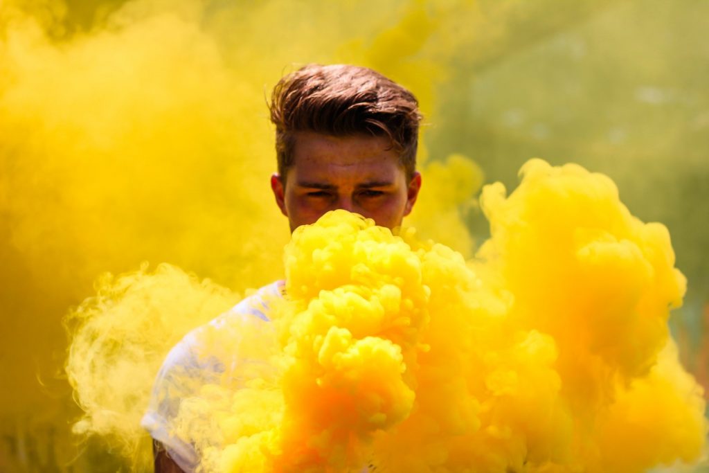
Question Time!!
- What do you think of this photo?
- What story does it tell you?
- Any juxtapositions that you are feeling?
- What kind of ad could this be used for?
Wow, that was a lot to read through…
So what are we trying to tell you here? Color matters in design work. No matter what color you pick for your brand, it will stand out better than if it was just in black and white (That being said, your design needs to look good in black and white regardless). Color can be endlessly useful, but it must be used wisely.
In the next part, we will be discussing the importance of color in branding as well as in marketing. That will be a deeper dive into the use of color now that you get the psychology behind colors themselves.
Build your brand, generate revenue, grow your customers.
Contact us through the following
Email us: he***@*******gn.com or call (916) 581-1777
A Blushing Year For 2019
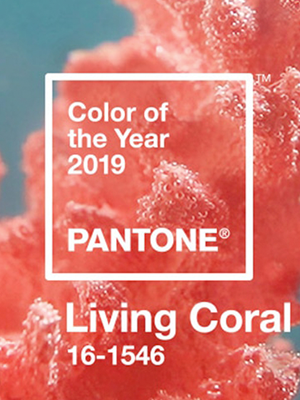
Say so long to Paisley Park and last year’s Prince inspired Ultra Violet color. We are here to share the awesome symbolism behind this year’s Pantone Color of the Year, Living Coral.
Everywhere you look and anywhere you go, screens follow. Technology has boomed and with it, we are exposed to news alerts, weather reports, status updates, tweets, pins, photos, texts… ah, the list goes on! We have slowly been desensitized. Every month we hear about trash taking over the environment and a new animal on the endangered species list. Along with the advent of tech and social media comes the feeling of isolation and less empathy…
ENTER 2019 – The goal: reconnect, nurture, and foster genuine connection. Like the delicate and complex coral reef systems of our awesome oceans, we are all in need of more kindness and playfulness. Reach out and revitalize your community. Look to the Earth to make your mark in a beautiful and sustainable way.
Did you know that coral reefs are nature’s protection from storms? In the same way, we should look to help protect our fellow neighbor and our environment we all share. In our constantly changing society, it is easy to shut down. Remember to build bridges, not walls. Let the golden warmth of Living Coral remind you to glow from the inside out with positivity. Pass on the joy this year! Happy 2019 ~
Interested in bringing some Living Coral to your brand?
We’re ready to serve up fresh ideas and designs that will make you blush!
Email us: he***@*******gn.com or call (916) 581-1777
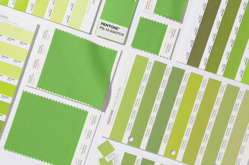
Design with Greenery
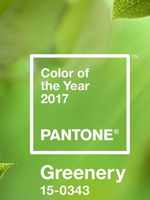
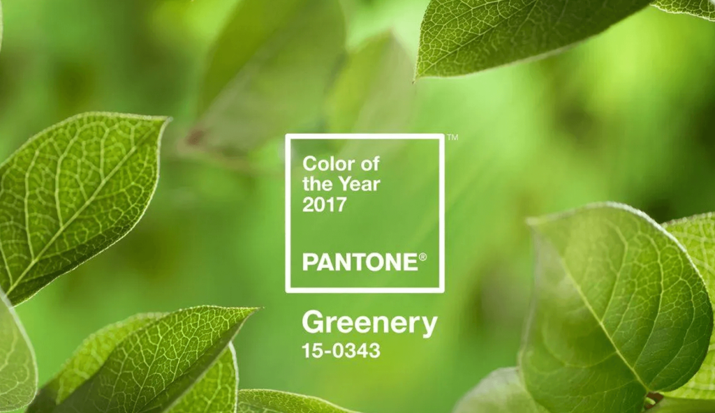
Ahh… Greenery! You can almost smell the freshness; so uplifting. It’s Pantone’s new Color of the Year for 2017. Just like the first days of Spring, Greenery is symbolic of new beginnings. It’s a fresh, bright green that evokes nature, hope and fresh beginnings.
Leatrice Eiseman, the executive director of the Pantone Color Institute, states that “greenery bursts forth in 2017 to provide us with the reassurance we yearn for amid a tumultuous social and political environment. Satisfying our growing desire to rejuvenate and revitalize, Greenery symbolizes the reconnection we seek with nature, one another and a larger purpose.” It reminds us of bamboo or green smoothies, plants in our garden and it certainly makes us cogitate on bright ideas for the new year.
WHAT IS THE COLOR OF THE YEAR?
The Pantone Color Institute is the global authority on color. Each year, they assemble a panel of industry professionals to select a color of the year. This panel examines influencers from the design world — graphic design, textile, digital, fashion, etc. — and study what’s been happening in the arts & entertainment fields, popular travel destinations, pop culture, and socio-economic conditions. The color of the year is a choice proposed to capture the mood of our times. And for those of us who are in the design world, it’s a guide that may influence design projects of all kinds, from print to web and everything in between.
WHAT DOES THIS MEAN TO YOUR BUSINESS?
Now may be a good time to reconsider your brand colors. Whether Greenery is a choice color for your business or not, every so often, it’s a good idea to review your brand and consider a fresh approach. For example, Greenery would be a popular choice for food or spa companies. Brands that want to express strong environmental characteristics will also use colors like Greenery. On the contrary, it would be a more modern and bold choice for traditional corporate businesses — industries like financial or insurance type services — who quite often use hues of blues (say that 10x fast!). For those who work in those sectors and are looking to stand out, without losing any meaningful perceptions like trust or significance, Greenery would be a great choice for the new year.
FEELING INSPIRED?
Ready to make a fresh start and bring new life to your business? Let’s explore how we can breathe new life into your brand and create some dynamic stuff! Call us at (916) 581-1777 and let’s start a conversation.